Top 50 Home Furnishings Brands on Shopify Plus: Customer Bond Building Teardown
Here’s the top 50 home furnishings brands on Shopify Plus. For 10 of the biggest, I’ve assessed adoption of customer bond building. With practical tips for improving your own store.
From the audit, I can confidently say Home Furnishings brands provide shopping experiences dominated by sameness. Most surprisingly was how top brands miss out on connecting products with visitors. With only a few exceptions. In this Home Furnishings teardown, I’ll share some of our key findings.
Customer Bonds?
Brands tell us… “We are growing web traffic from qualified sources but our conversion rates remain low”.
Next comes the industry obsession. Conversion Rate Optimization (CRO). Teams tackle low conversions by redesigning, copying competitors, A/B testing, personalization, using upsell and cross sell apps. It goes on.
But. They’re fighting the wrong battle.
Focusing on low conversion rates ignores bigger revenue opportunities. Achievable with an alternative approach. We’re calling that Customer Bond Building – the ecommerce revenue acceleration method. Have top-tier machine learning algorithms connect your products with the right buyers in real time.
This teardown looks at the state of customer bonds across Shopify Plus’ top home furnishings brands. And provides practical tips how to add and strengthen yours.
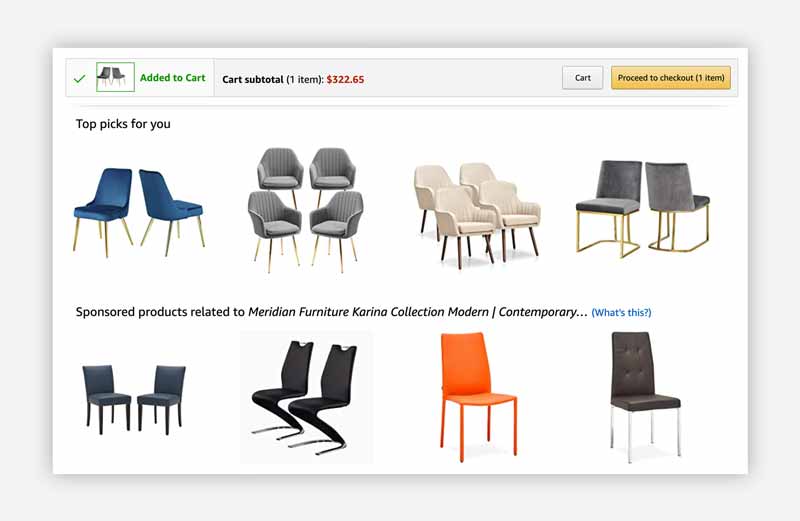
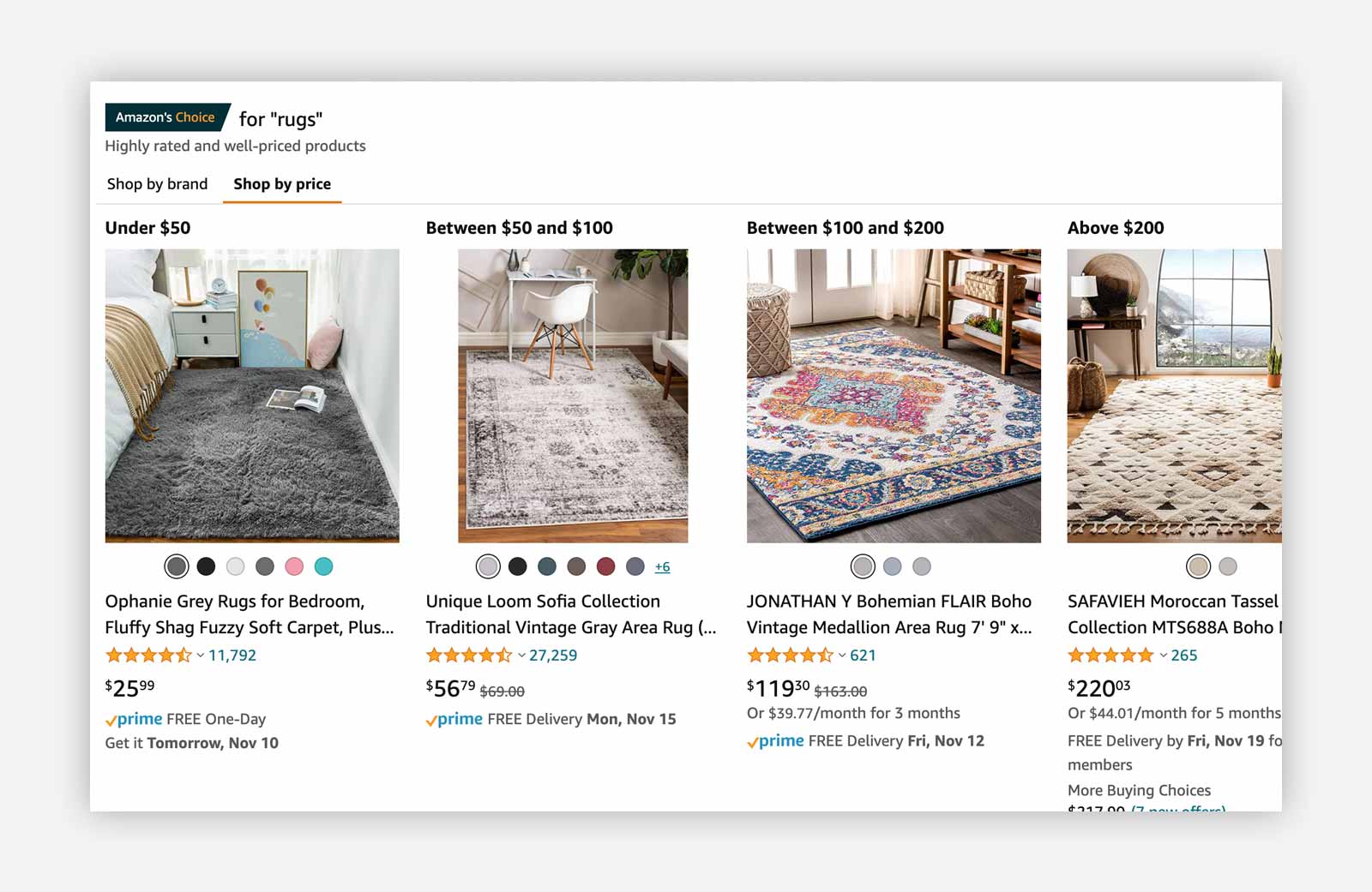
I’ll be using Amazon.com as a reference point. Love or hate them. Amazon are long time practitioners of customer bond building. Playing ecommerce at the highest-level.
Top 50 Home Furnishings Brands on Shopify Plus
There are countless home furnishings stores across the Internet. To whittle down the list, we prioritized brands based on their ranking on Shopify Plus (hat tip: StoreLeads).
Note: Clicking the magnifying glass icon next to a brand below will link you to a full analysis of customer bonding experience.
KEY TAKEAWAYS
- Our audit reveals very low use of machine learning – most top home furnishings brands rely heavily on manual (hard-coded) customer bonds.
- Collection pages are the least attended pages across brands.
- 90% of home furnishings brands reviewed do not personalize the buying lifecycle at all.
- We see signs of improvement — many brands already experiment with product recommendations on homepage, search box, PDP, cart, and checkout.
- This is our ongoing project to help brands crack the ‘Amazon code’. Learn and apply it to your own operations.
Challenges for Home Furnishings brands on Shopify Plus
The goal is innocent enough. Connect visitors with the right products. Conversions and revenues will follow.
In reality, it’s super-complex:
- Anonymous visitors – 95% or more of visitors never purchased anything before. Nor familiar with your brand and products. You can only guess why they’re visiting and their needs.
- Large product catalog – home furnishings stores have thousands of products. Many go unsold. You are tagging and grouping products in collections. This limits your merchandising power.
- Fragmented buying journey – most visitors are not impulse buyers. We tend to research and visit many other sites. Then we make a decision. You have scant opportunity to create relevancy across multiple buying sessions.
- Time on site – traffic from mobile continues to grow. But mobile shopping time is 50% shorter than from desktop. You have moments to connect a visitor with a product. Milliseconds. This explains why mobile KPIs underperform compared to desktop traffic.
Your ecommerce operations likely make things worse:
- Budget – most money goes to demand marketing. Return-on-advertising-spend (ROAS) keeps evaporating. It’s harder and harder to create sustained revenue growth.
- Team – you’re all stretched thin. Leadership is often behind the curve. Building connections with visitors is core to winning.
- Data – audience and product intelligence lives across multiple applications. Integration and making sense of it all goes unattended.
- Engineering – online brands commonly rely on agency partners. This might save when running core operations. Just costly and limiting for anything extra.
- Machine Learning – Amazon has won the AI ‘arms race’. 99% of Shopify stores can’t deal with the threat.
Customer Bonds. Conversions.
We lived conversion rate optimization (CRO) with our previous company, HiConversion. We spent over 10 years helping hundreds of well known brands. P&G, L’Oreal, Hugo Boss, Tommy Hilfiger, Timex, and many others. Using our innovative adaptive testing and experience optimization technology.
The truth is testing and optimization works. It drives a high ROI.
However, after many thousands of conversion rate optimization ecommerce projects. We realized brands are looking in the wrong direction.
We discovered conversion rate optimization is improving buying experiences. For returning customers and visitors who are alike them. Which only impacts up to 10% of all web traffic.
How about the remaining 90% of visitors? They come to your site and leave. Without ever finding a product of interest.
It’s a gaping hole in their operations. We call these Customer Bonds. Dynamic layers of hyper-personalized content. Designed to create ‘bonds’. Real-time connections. With wide varieties of shoppers, all having different product wants.
Results that speak for themselves: Customer Bond Building works
- Synegree Fitness increased 545% revenue per visit lift in 14 days
- Latico Leathers added 393% more purchases in 90 days
- Ruohonjuuri boosted rev per visit 870% in one week
- Genius Books grew 340% revenue per visit in 30 days
- Supplement Warehouse saw 35% of sales influenced in 30 days
Just a handful of success stories from 1200+ brands building customer bonds in 2021.
The ‘Amazon Way’.
One secret of Amazon’s success is their use Customer Bond Building.
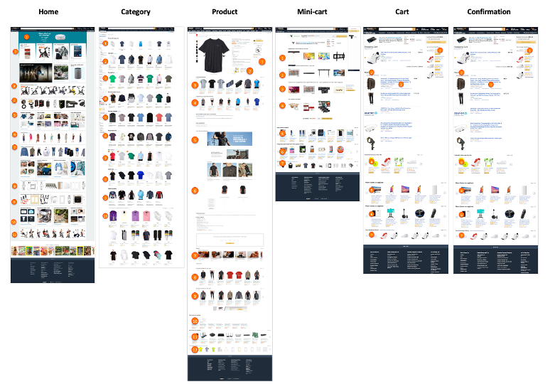
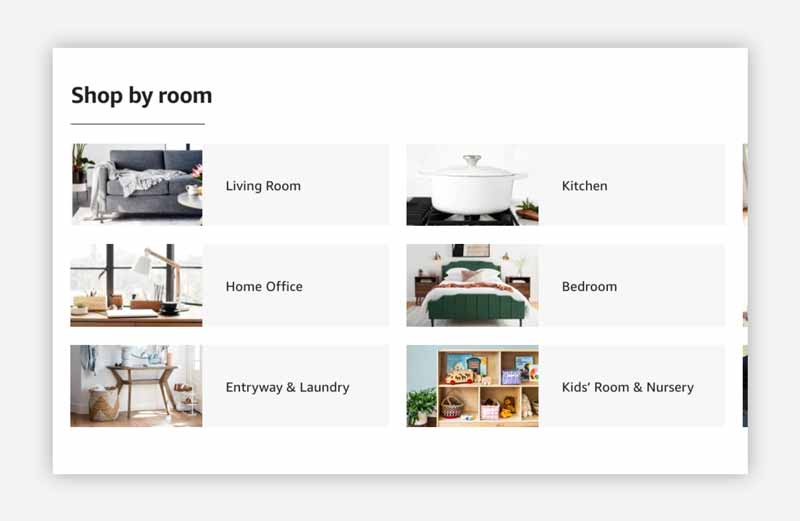
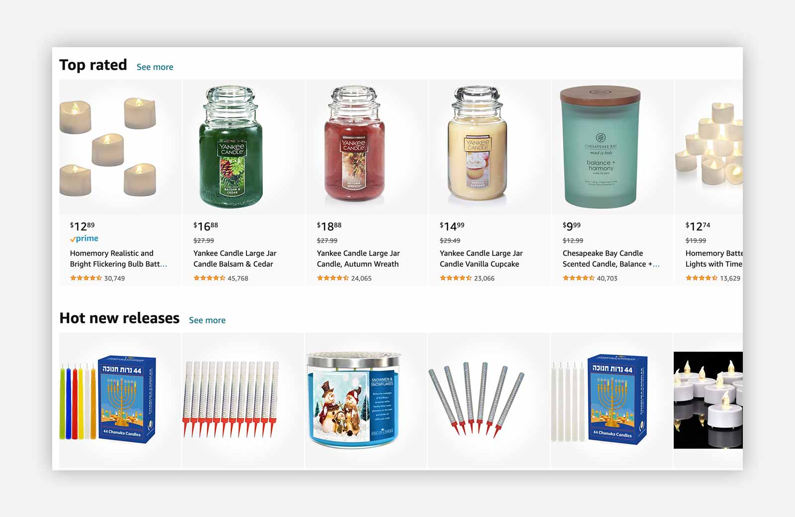
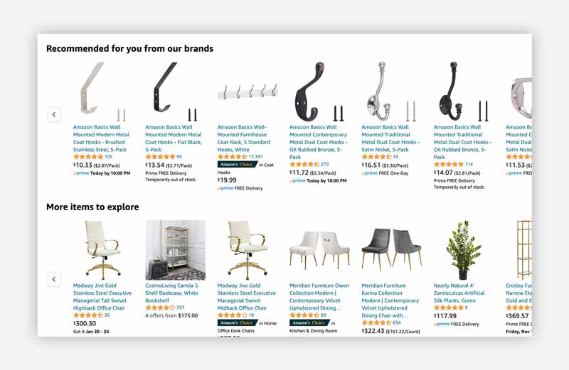
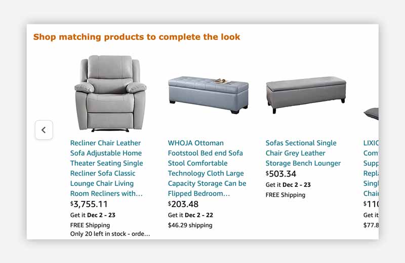
The orange circles on the image here indicate customer bond building ‘blocks’ on Amazon’s web pages.
The ‘Amazon grade’ shopping experience has become the industry standard. And it’s essential merchants bring the best of those experiences to their own Shopify store.
Top 10 Home Furnishings brands: full teardown
Using Amazon as a reference. We assessed where established brands are on their Customer Bond Building journey (and are they, well, any good?).
We rated our ‘tear-downs’ by (where possible) by looking for evidence of Customer Bonding activities. Relating to how you currently manage your Shopify channel:
- AUDIENCE – How well you connect each different visitor persona with relevant product discovery options.
- BEHAVIOR – How your store is set up to detect, act on and capitalize from dynamic purchase behavior.
- CONTENT – How successfully are you taking advantage of the real estate across your store’s pages.
- PRODUCTS – How dynamic are the ranges of different products you show to visitors.
- LIFECYCLE – How intelligently your store engages different visitors across their buying journey.
- GOALS – How effectively your store achieves and measures your discrete business goals. (Note: knowing each brand’s business goals was beyond our audit, so we excluded this from our final analysis).
We include a score out of 5. So you’ll see what sets these brands apart. Maybe inspiring improvements to your own site.
Pier 1
Obviyo’s Rating: 1.5 out of 5
Overview: Pier 1 is the Texas-based online retailer specializing in imported home furnishings and decor, particularly furniture, table-top items, decorative accessories, and seasonal decor. A longtime brick and mortar brand, in 2020 it reimagined itself as an eCommerce business, launching on Shopify Plus due to the COVID-19 pandemic.
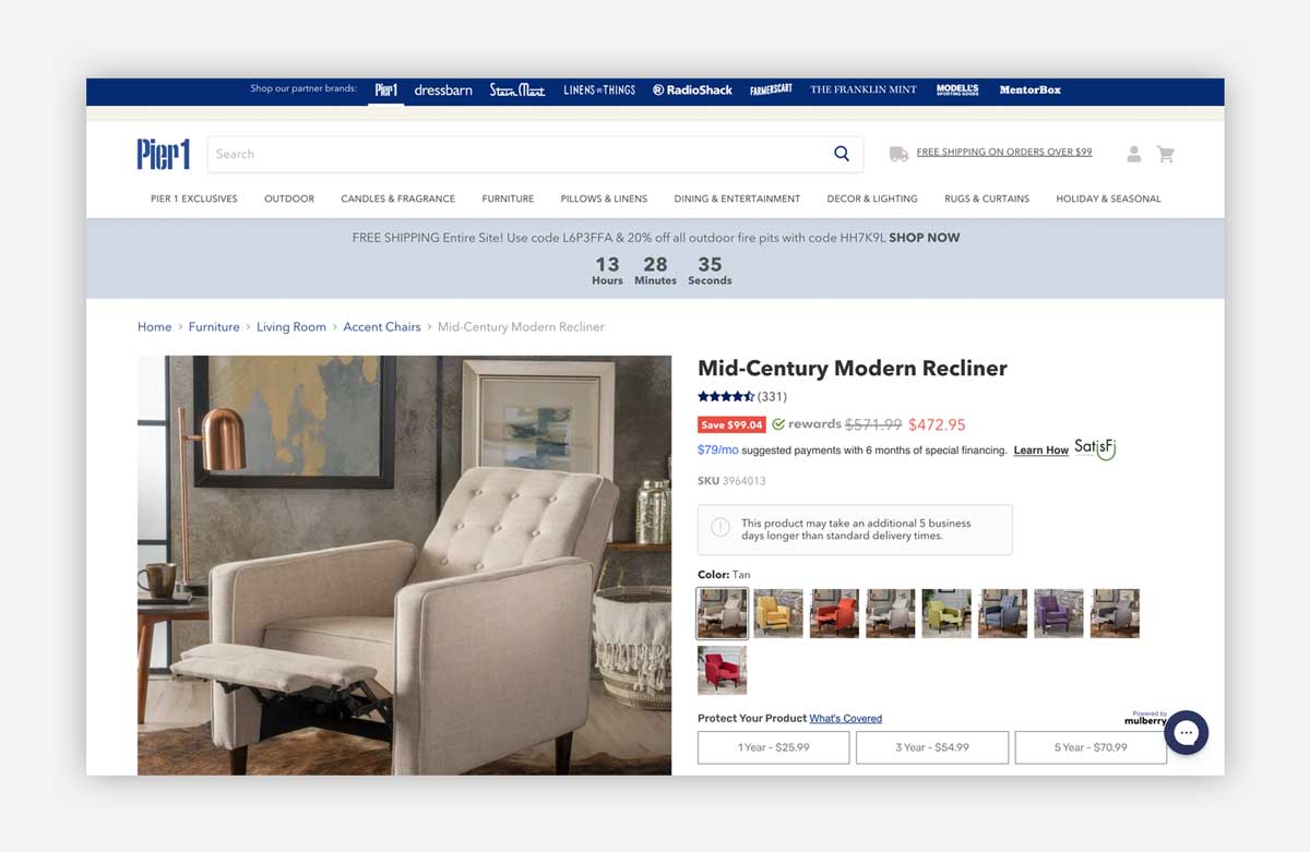
Our take: Pier 1 boasts 90,000+ products and dozens of categories. But with only very basic product recommendations on a handful of pages, like product or cart pages, we see a Shopify Plus store with so much unrealized potential. Even with small changes, they could get outsized gains.
| Activities breakdown | ||
| Audience | 0 | The same shopping experience for new and returning visitors. |
| Behavior | 0.5 | Recommendations are changing with each page load, but non-relevant product types. Semi-effective attempt to upsell in cart. |
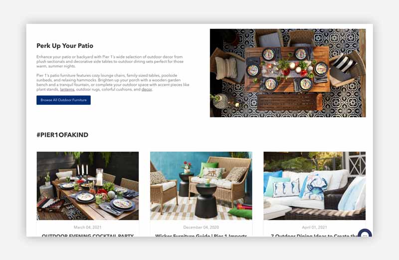
| Content | 0.5 | Nice job with ‘Outdoor Patio Furniture & Decor’ collection page. Other collection pages are just vanilla grid layouts. |
| Lifecycle | 0 | Visitors are treated the same irrespective of their stage in the buying cycle. |
| Product | 0.5 | Large catalog that requires effective grouping of products in reasonable sized collections. |
| Total | 1.5 |
What’s Good?
- Great use of branded content
- Enormous selection of products.
- Robust social proof (reviews).
- They offer a separate app for mobile buyers.
What could be Improved?
- Hard to discover products without using search or navigation.
- Category pages are identical, generic layouts, with simplistic filters.
- No upselling or cross-selling in cart or checkout.
Homesick
Obviyo’s Rating: 2.25 out of 5
Overview: Founded in 2016, Homesick is a home fragrance and lifestyle brand known primarily for its innovative soy wax candles. Offering close to 200 ‘personal’ products representing every US state, cities and countries; to occasions, people and moments.
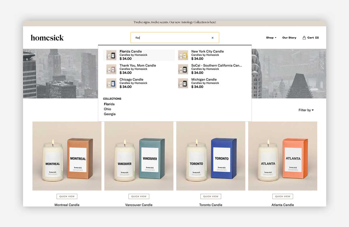
Our take: As a modern Internet brand, Homesick is clearly innovating their online shopping experience. They use some of the leading Shopify apps and it’s evident they care about their product discovery experience. Shame they missed the obvious state/city/country personalization win with me on their homepage.
| Activities breakdown | ||
| Audience | 0 | The same shopping experience for new and returning visitors. |
| Behavior | 0.75 | Good upsell and cross-sell in cart and checkout. Not deeply personalized. |
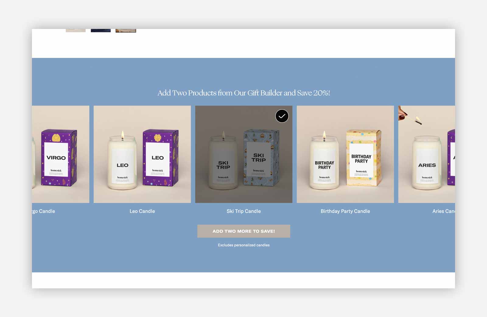
| Content | 0.75 | PDP ‘Gift Builder’ is nicely done. Collection pages could be stronger. |
| Lifecycle | 0.25 | Simple combinations of products check the box, but we don’t see any dynamic merchandising. |
| Product | 0.5 | Very focused catalog limits broad product selections. |
| Total | 2.25 |
What’s Good?
- Exceptional branding and visual design of products and overall site.
- They have an intelligent search bar (most likely powered by Algolia).
- Seem to be prioritizing product recommendations and bundles on high-value pages.
What could be Improved?
- Static collection pages do not aid deeper product discovery for casual shoppers.
- Missed opportunity to promote my ‘state’ candle directly to me (e.g., I was browsing from a Florida city).
Lulu and Georgia
Obviyo’s Rating: 1.25 out of 5
Overview: Based in LA, Lulu and Georgia design and curate the ‘best in interiors to inspire your home’. They are considered a ‘high-end’ brand based on their pricing.
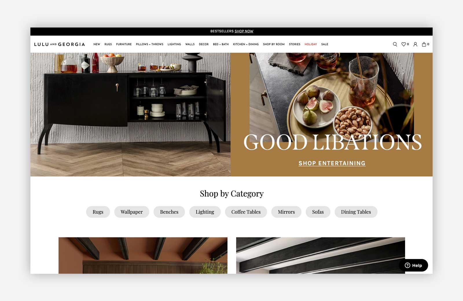
Our take: Lulu and Georgia oozes sophistication. And while they get credit for a sprinkling of personalized experiences, there’s a missed opportunity to showcase more products on their homepage and create more dynamic, engaging collection pages.
| Activities breakdown | ||
| Audience | 0 | The same shopping experience for new and returning visitors. |
| Behavior | 0.5 | Semi-effective cross-sell on PDP and in checkout. Not deeply personalized, with shallow selection. |
| Content | 0.25 | Most pages appear manually curated. Collection pages are using vanilla layouts, with ‘trending products’ buried in footer. |
| Lifecycle | 0.25 | Email and promo pop-ups tell us they are targeting first time buyers. |
| Product | 0.25 | Broad inventory with very limited overlap. |
| Total | 1.25 |
What’s Good?
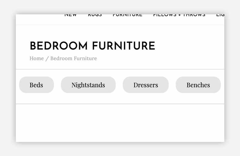
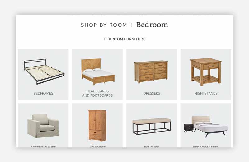
- Category signposting across their landing pages aids deeper discovery.
- Seem to be prioritizing recommendations on PDPs to aid engagement. They are positioned above reviews.
What could be Improved?
- Homepage visual-merchandising is not dynamic; considering how many products they have.
- Collection pages are static. ‘Trending products’ are buried at the bottom of page.
- No evidence of upsell or cross-sell in their checkout (despite having recommendations on cart page).
Burke Decor
Obviyo’s Rating: 2.75 out of 5
Overview: Burke Decor is an online boutique featuring home decor, furnishings, gifts and home accents by designers from around the world.
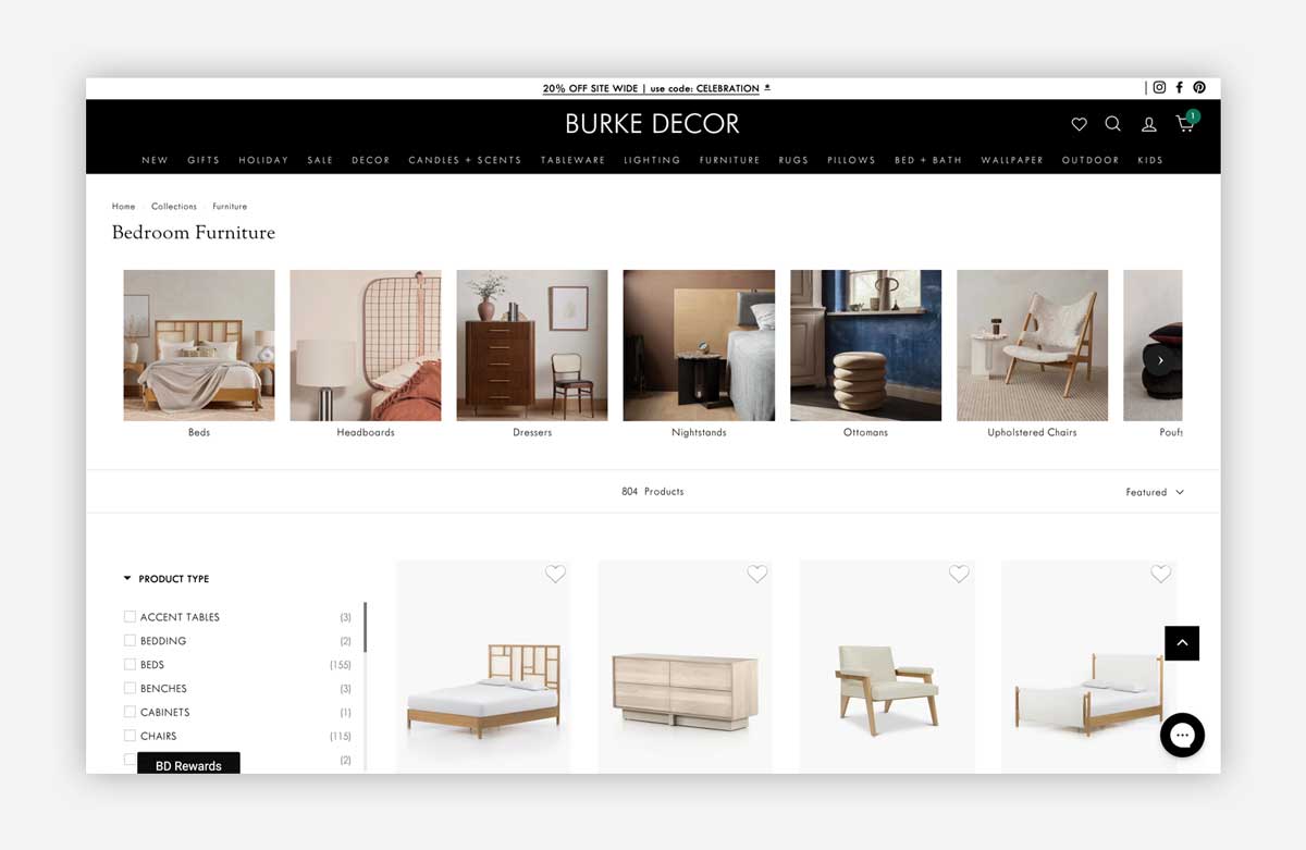
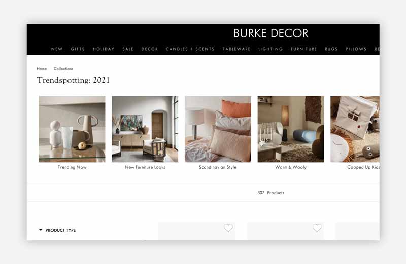
Our take: Burke Decor have clearly put thought into their visual merchandising strategy. Use of product photography as ‘filters’ on collection pages was a standout tactic. This is key to aid product discovery, especially when a brand has 10s-of-thousands of products. However, their cart experience, while rightly focused on the sale, lacked any evidence of dynamic personalization.
| Activities breakdown | ||
| Audience | 0 | The same shopping experience for new and returning visitors. |
| Behavior | 0.75 | Multiple product recommendations are prioritized on PDPs. |
| Content | 1 | The ‘LOOKS GREAT WITH’ experience on product pages is excellent. |
| Lifecycle | 0.5 | Cart upsell/cross-sell inspires additional purchases. |
| Product | 0.5 | Broad inventory, with strong use of photography at top of collection pages. |
| Total | 2.75 |
What’s Good?
- Solid curation of products on homepage, but it wasn’t personalized or dynamic.
- Product pages use 4 different kinds of recommendation widgets creating lots of inspiration.
- Visual filters on collection pages help create strong jump-off points.
What could be Improved?
- Checkout page misses opportunity to further upsell and cross-sell.
- Product page recommendations could be expanded to further exploit category inventory.
- The mobile shopping experience is ‘responsive’ but not ‘device specific’ for mobile.
Overview: Canadian stalwart, The Brick, is a popular retailer of furniture, mattresses, appliances and home electronics. Founded in 1971, it has a couple hundred retails stores and a busy online site.
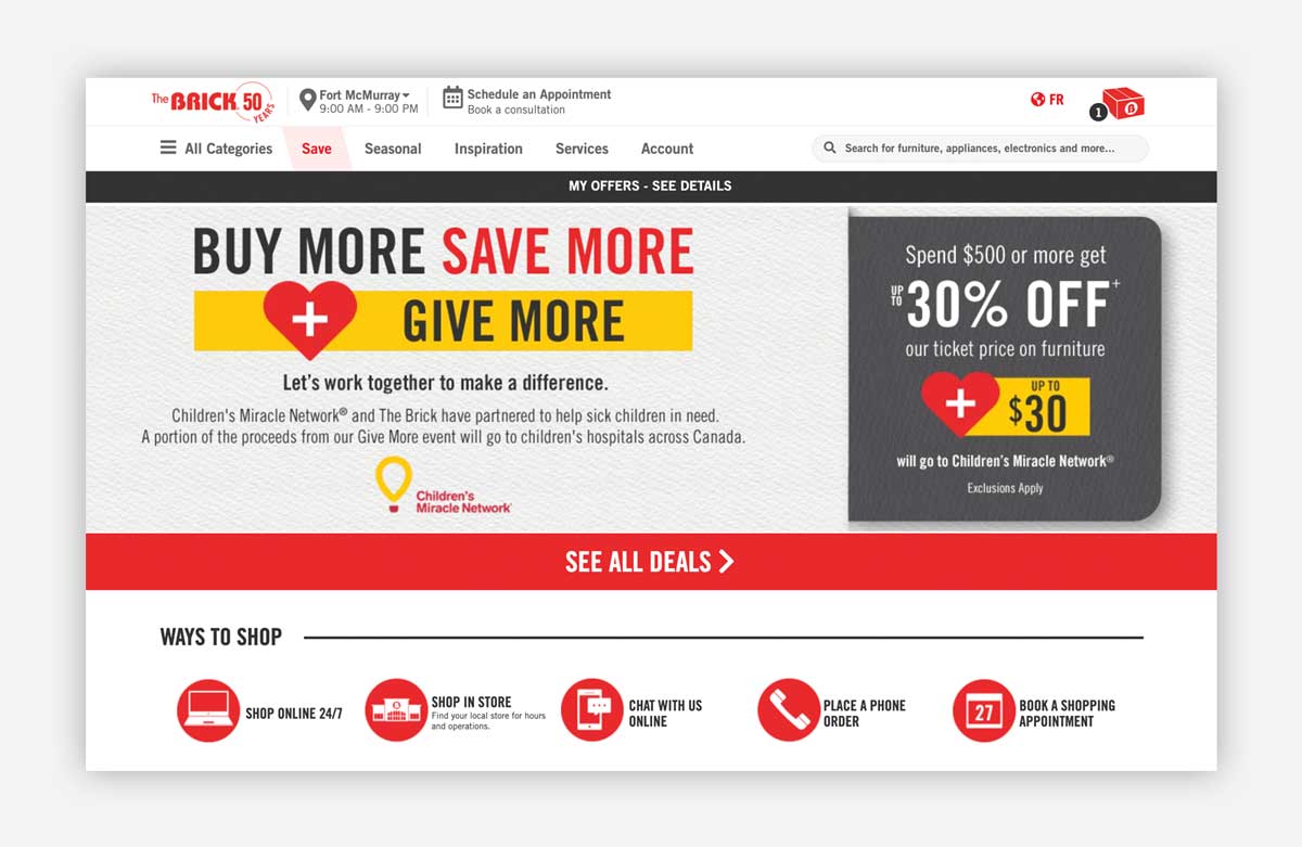
Our take: The Brick has a rather unique approach to merchandising and product recommendations. However, it feels inconsistent, and the marketing bias of the website can at times overshadow the browsing experience. A big opportunity would be to create more dynamic, personalized deals catering to different visitors.
| Activities breakdown | ||
| Audience | 0 | The same shopping experience for new and returning visitors. |
| Behavior | 0.5 | Category pages are strongest when it comes to product discovery, blending branded content with product lists. |
| Content | 0.25 | The entire site is bias towards promotional content, rather than products. |
| Lifecycle | 0.25 | Almost everything is geared only toward new visitors, but is not dynamically curated. |
| Product | 0.5 | Large inventory, with good use of curated category pages. But it is confusing where to start product discovery. |
| Total | 1.5 |
What’s Good?
- Fascinating visual merchandising and marketing strategy heavily focused on education and inspiration on high level collection pages.
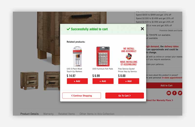
- Clear use of upselling inside the mini-cart popup.
What could be Improved?
- The bias for promotional content is visually overwhelming, particularly on the homepage.
- Surprised to see no dynamic product recommendations on PDPs, given visual merchandising is so strong elsewhere.
- No further recommendations inside checkout.
Poly & Bark
Obviyo’s Rating: 1.5 out of 5
Overview: Famous for their sofas, Poly & Bark promise affordable prices, delightful customer support, as well as free shipping and returns.
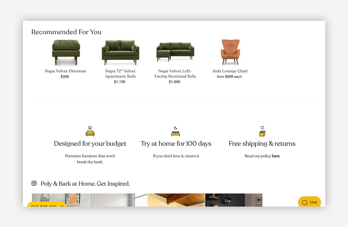
Our take: With a fantastic, fresh web-design, Poly & Bark has so much potential to rapidly improve their personalization efforts. Their product pages have an untapped opportunity to showcase way more product variety and inspire more discovery beyond their best-selling sofas. (I also noted they are greeting EVERY visitor as “Dear Customer” with a Holiday shipping message).
| Activities breakdown | ||
| Audience | 0 | The same shopping experience for new and returning visitors. |
| Behavior | 0.25 | Scant overlap of categories or product variety throughout buying journey. |
| Content | 0.75 | Products are beautifully presented, given room to breathe. Blending with more dynamic branded content would make this a 1. |
| Lifecycle | 0 | No product recommendations in mini-cart, cart or checkout. |
| Product | 0.5 | The ‘In Stock’ filter on collection pages is a smart way of thinking about leveraging meta data. |
| Total | 1.5 |
What’s Good?
- Excellent product photography captures attention and makes each product standout.
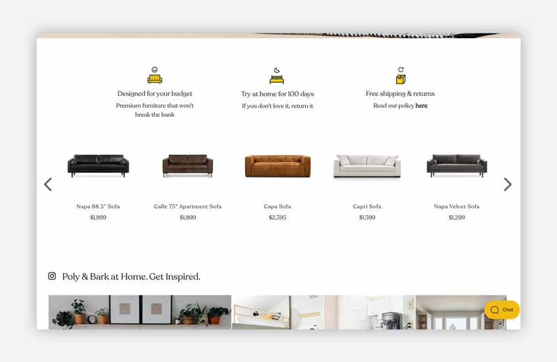
- The carousel of sofas on homepage creates immediate jump-off points.
What could be Improved?
- Single ‘Recommended for You’ widget on PDP gives impression this store has only a handful of products.
- No product recommendations inside cart, or checkout.
Leon’s
Obviyo’s Rating: 2 out of 5
Overview: Founded in 1909, today Leon’s is one of Canada’s largest retailers, selling a wide range of merchandise including furniture, mattresses, major appliances and home electronics.
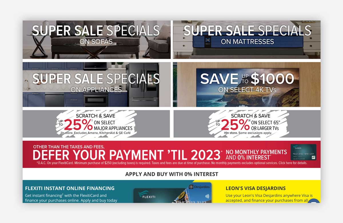
Our take: Much like The Brick, Leon’s homepage is nearly exclusively dedicated to static promotions versus dynamic product merchandising. The product pages have solid recommendations for related products and ‘You May Also Like’ widgets. A lack of dynamic upselling inside the checkout is an area of growth to explore. Collection pages are also ripe for better dynamic curation.
| Activities breakdown | ||
| Audience | 0 | The same shopping experience for new and returning visitors. |
| Behavior | 0.5 | PDPs do decent job of introducing more jump-off points with various recommendations. |
| Content | 0.75 | The mattress ‘Ways to Shop’ guided navigation is excellent. |
| Lifecycle | 0.25 | Inconsistent product recommendations in mini-cart popup. |
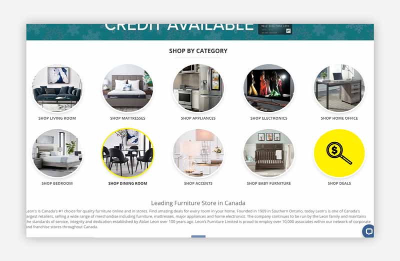
| Product | 0.5 | ‘Shop by Category’ on homepage does nice job of creating jump-off points. Generally, collection pages are not dynamically curated. |
| Total | 2 |
What’s Good?
- Website has clear category navigation across the top of the site.
- Well designed, visual search bar on each page (most likely powered by Findify).
What could be Improved?
- Collection pages are busy and filtering is complicated, with endless toggles.
- No product recommendations inside cart, or checkout.
- Mobile product recommendation widgets are only ‘responsive’, not specific to mobile devices. Perception of product variety is reduced by the layout.
Ruggable
Obviyo’s Rating: 3 out of 5
Overview: At just only a decade old, fast-growing Ruggable is well known for creating the first washable 2-piece rug system.
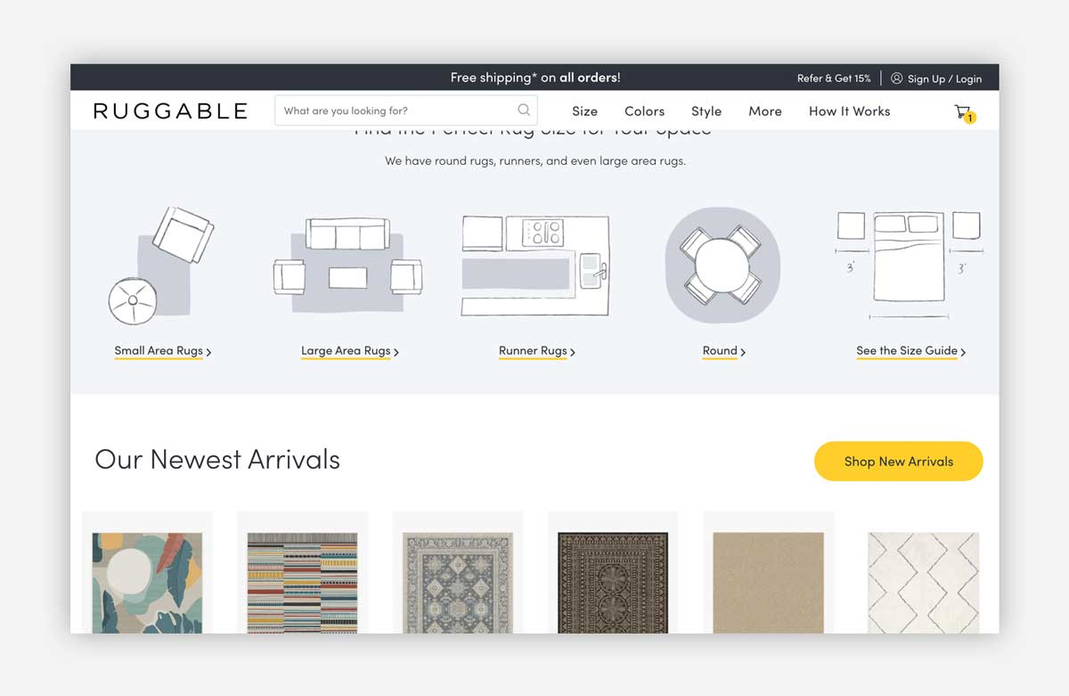
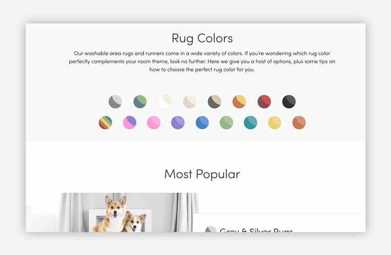
Our take: Individual rugs are hard to differentiate when merchandising a store like this (they have the same shape and footprint, creating a repeating pattern). While the homepage uses innovative filter illustrations, that visual experience is lost inside collection pages which feel generic in comparison. That said, Ruggable is absolutely a standout example of a brand prioritizing and strategizing with personalization.
| Activities breakdown | ||
| Audience | 0.5 | Recently viewed products are prioritized for returning visitors on the homepage. (Note: the only brand on our list to do this!). |
| Behavior | 0.5 | Collection pages are weak when compared to the dynamic merchandising on homepage and product pages. |
| Content | 0.75 | ‘Find the Perfect Rug Size for Your Space’ widget on the homepage is excellent, but this ‘guided’ UX doesn’t continue through rest of buying journey. |
| Lifecycle | 0.5 | Incentive upsell in mini-cart, but no actual products to choose from. Checkout has no recommendations. I did feel like the site ‘remembered me’ however, with my recently viewed products easy to see. |
| Product | 0.75 | We love how product meta data is at the heart of how you ‘shop’ this site. We think they could further exploit this beyond nav, homepage and tag pages. |
| Total | 3 |
What’s Good?
- Strong UI design and visual merchandising make the homepage engaging for first time visitors. Highlighting recently viewed products creates immediate entry back into ‘shopping flow’.
- Evidence of personalized product recommendations across their site (likely powered by SearchSpring).
What could be Improved?
- No effective personalization in mini-cart, cart, or checkout.
- Missed opportunity to better curate the collections pages with dynamic recommendations.
Maiden Home
Obviyo’s Rating: 1.25 out of 5
Overview: Maiden Home is a direct-to-consumer (DTC) brand featuring handmade and customizable furniture made in North Carolina.
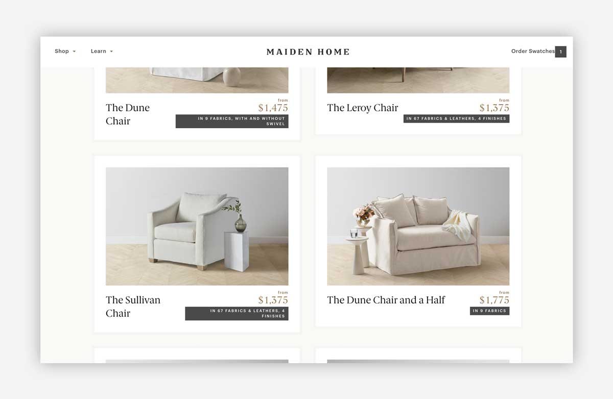
Our take: Each product on Maiden Home feels special and the design of the site amplifies that. However, for there to be scant evidence of any personalization or product recommendations on any page left us wondering if they are leaving unrealized sales on the table.
| Activities breakdown | ||
| Audience | 0 | New and returning visitors treated the same. |
| Behavior | 0.25 | This is a very passive site with regards to browsing – the content doesn’t change or update dynamically. |
| Content | 0.5 | The visual design of this site is stunning. However, the simplicity betrays how much variety is available under the surface. |
| Lifecycle | 0 | No personalized recommendations were observed during initial product discovery or purchase phases. |
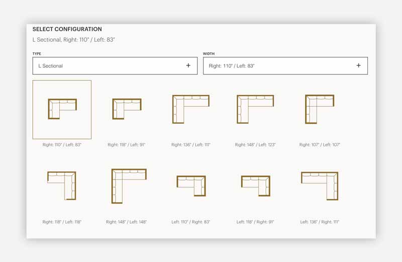
| Product | 0.5 | The PDPs are rich in product meta data and shopping controls. Would love to see these combinations exploited in other areas of the site. |
| Total | 1.25 |
What’s Good?
- Excellent visual design and photography across the site motivates engagement.
- The single column collection pages give attention to each product in a way other sites on our list do not.
- The PDP ‘configuration’ logic is nicely done.
What could be Improved?
- No personalization or dynamic merchandising on homepage, collections, PDP, or cart/checkout.
McGee & Co.
Obviyo’s Rating: 1.5 out of 5
Overview: McGee & Co. is not just a home furnishing website; it’s become an empire with a Netflix media deal and expansion into other major retail partners such as Target.
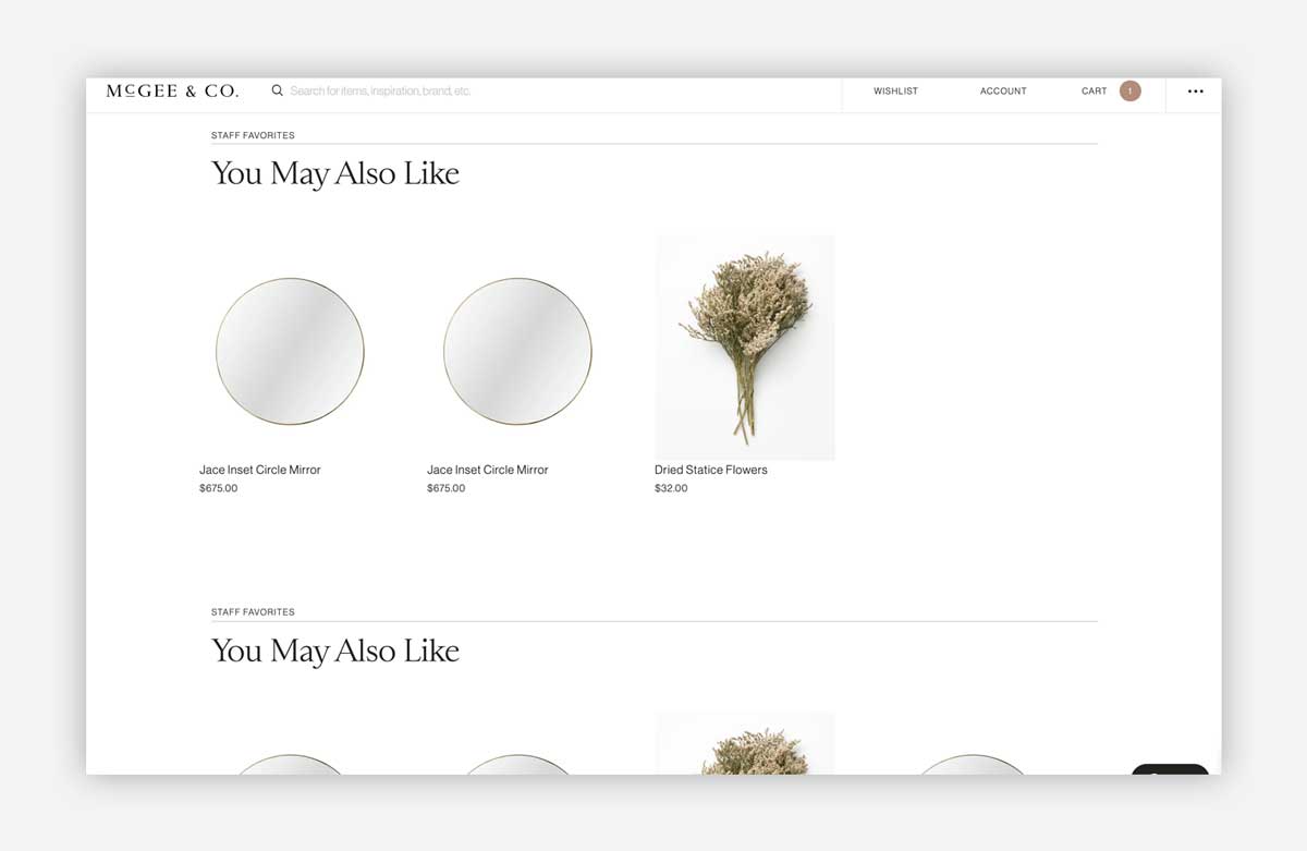
Our take: I was expecting McGee & Co to have more dynamic curation and custom visual merchandising techniques across the entire site. As I ventured into the cart and checkout, Shopify’s generic design made the buying journey feel more transactional than inspirational. They are taking good steps forward with product recommendations on cart and PDPs, but these also felt limited in scope for a store with over 20,000 products.
| Activities breakdown | ||
| Audience | 0 | New and returning visitors treated the same. |
| Behavior | 0.25 | ‘Staff favorites’ recommendations had very shallow, non-personalized options. |
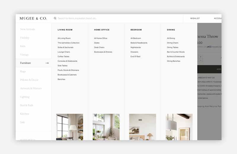
| Content | 0.5 | Great visual design and the vertical, persistent navigation is nicely done. However, all collections layouts are static with no personalization or branded content. |
| Lifecycle | 0.25 | Recommendations were observed as broken/duplicated during purchase phases. |
| Product | 0.25 | The PDPs are very simplistic. Huge missed opportunity to showcase depth and breadth of large inventory here. |
| Total | 1.25 |
What’s Good?
- Various product recommendations on PDP and cart page.
- Overall, the design of the navigation and category options encourage initial discovery.
What could be Improved?
- Despite upsells in the cart, these were duplicated and the layout looked broken.
- No upsell/cross-sell in checkout. Another top brand missing this opportunity.
- Generic collection layouts won’t appeal to new visitors.
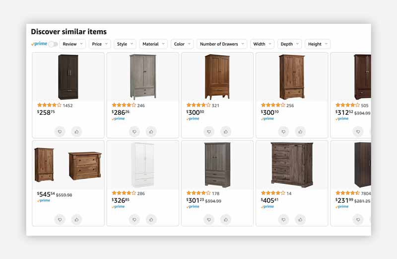
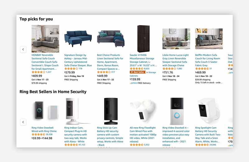
Amazon’s Example: ‘Expanded category recommendations on PDP’
Start building your Customer Bonds
Connecting the right audience to your products is crucial for the effectiveness of your Shopify channel. Not everyone has the same needs or preferences. So you have to quickly identify whom to focus on. The conversions will follow.
And it all starts with a free 7-Day Conversion Trial*.
- Install Obviyo’s certified Shopify app – then claim your seat from the dashboard.
- Meet with us, to review your conversion health and goals.
- We’ll set-up your initial Customer Bond Building program.
Already deep into CRO and curious about this alternative? Book a demo to meet with one of our experts.
*7-Day Conversion Trial: for new, eligible customers only. Stores selling 50 or more products and over $1-million in annual Shopify sales.


