For Shopify Home Furnishings Brands: 5 Ways To Unlock Revenue Like Amazon [GUIDE]
No company has more successfully applied advanced ecommerce personalization AI than Amazon. But what happens if you run it on your Shopify home furnishings store?
In this article I will show you how to replicate Amazon’s machine learning secrets to unlock hidden revenue on your Shopify store.
But first, some context.
Amazon’s machine learning engine is estimated to influence 35% of all sales on their marketplace. The crown jewel is Amazon Personalize – a mega-powerful product recommendation engine.
In fact, Amazon pioneered personalization and product recommendations. Securing one of the industry’s first patents. Perfecting it with 20-years of R&D.
Recently Amazon commercialized this service. Opening it up for other companies to build upon. Sparking our idea – to bring Amazon’s revenue growth engine to Shopify.
That’s why we partnered with Amazon’s machine learning team. Guiding the development of Obviyo’s Shopify app. Powered by the same recommendation algorithms used on Amazon’s marketplace. (For more details about how we built this app, see Amazon’s write up.)
Why should you care?
Because, as you know, selling home furnishings on Shopify is yet to be fully mastered:
- Average Shopify conversion rates hover stubbornly at 1.8%.
- Add-to-cart rates on Shopify are shockingly low. Research has it at 5.4%.
- Mobile traffic accounts for 2/3 of visits, yet yields 75% fewer sales when compared to desktop.
Translated, 9 out of 10 visitors never cross your ‘traffic-revenue barrier’. They fail to discover a product of interest and leave.
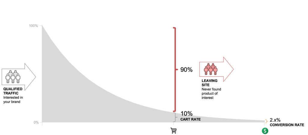
Counterintuitively, to solve a conversion problem like this. You need to forget about conversions and focus on visitor connections – we actually call this customer bond building.
This simple revelation was the single most impactful discovery we made since partnering with Amazon and Shopify. We suddenly saw how Amazon was able to exponentially accelerate revenues from otherwise unconvertible traffic.
QUICK DISCLAIMER
To avoid any misrepresentation. We do not have access or any insight into Amazon’s marketplace methods and best practices. That’s Amazon’s confidential intellectual property.
However, we have experience with and a deep knowledge of Amazon’s machine learning technology. Enabling us to perform analysis of Amazon’s marketplace. Formulating ‘Amazon-strength’ strategies for our clients.
In this article I’m sharing visual examples from Amazon’s marketplace. Hopefully, inspiring you to also study and learn from Amazon. With the goal of building bonds with your own visitors.
Once upon a conversion…
Even with Amazon’s machine learning, improving site conversion rate can still be daunting. There are many ways you could connect visitors with your products. With often obscure things having outsized importance.
To simplify. We re-imagined the model of your ecommerce conversion funnel. Borrowing the familiar ‘5Ws‘ concept of storytelling:
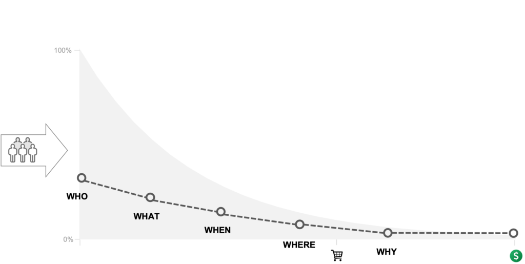
Great stories are designed to captivate. So it goes. Your site too has to have its own storytelling powers. Connecting your offering with visitors at multiple levels:
- WHO are your buyers?
- WHAT are you selling?
- WHEN they are ready to buy?
- WHERE on your site will they?
- WHY would they buy now and from you?
Now, since your site should talk to multiple audiences. You need many story funnels. All designed to connect – bond – with different visitors who have different needs and preferences:
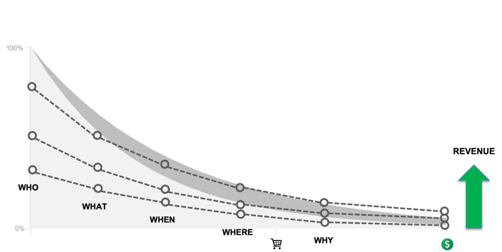
5 ways to drive Amazon-like revenue growth for home furnishings on Shopify
Using the 5Ws model from above, you can now easily assess your own home furnishings site. We provide quick tactics and practical next steps below. This section is also full of insights about how Amazon manages their story funnel to convert more traffic.
Even if you do not work with us, you and your team can steal any and all of these concepts.
1 – WHO are your buyers
Ecommerce traffic is fluid. A cocktail of diverse visitors. Coming from many different sources and constantly changing.
Inside your traffic are countless buying personas. Driven to your home furnishings site by marketing campaigns or other means. Also, every visitor is at different stages in their buying lifecycle. Some are brand new, while some are returning visitors or even existing customers.
TO DO: Determine if your site is a ‘one-trick pony’.
It’s simple. Just open a few pages on your site. Then use incognito mode in your browser and open the same pages. You’ll now experience your site as a first-time visitor.
Do you see a difference between regular and incognito pages? If not, your site is not effectively addressing the ‘WHO’ connection point.
The ‘WHO’ experience is the most critical factor of your overall success. Just like Yogi Berra said: “If you don’t know where you are going, you’ll end up someplace else.”
The root problem of WHO is the conventional approach to designing ecommerce sites. To serve perceived likely buyers. Appealing for only up to 10% of all visitors. Consequently, this design ignores otherwise non-buying traffic. The remaining 90% of all visitors.
THE ACTION: Serve different buying experiences for different audiences.
Amazon’s Example: Here’s how a page for new and returning visitors compare.
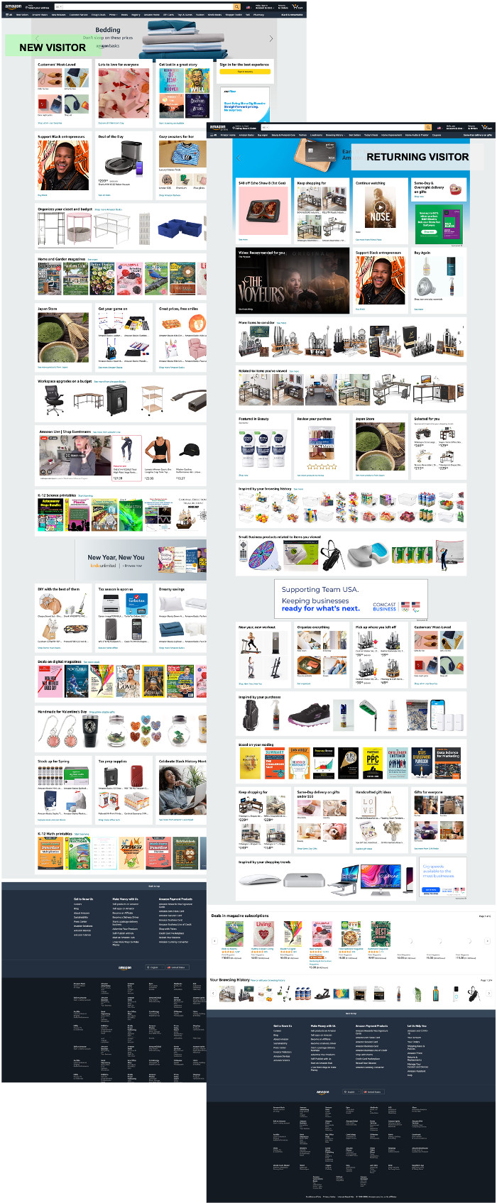
We encourage you to do your own side-by-side analysis of Amazon’s home pages. You will see half-a-dozen strategies at work.
For example, new visitors see a wider variety of products based on different criteria. Such as a section for price sensitive shoppers called ‘Workspace upgrades on a budget’:

While returning traffic see a list of related products from during prior visits:

The list of goes on.
Amazon spreads a wide net of product grouping options. Targeting new visitors with content like ‘Customers’ Most Loved’, ‘Organize your closet and budget’, ‘Deal of day’, ‘Great prices, free smiles’, ‘DIY with the best of them’, and ‘Handmade for Valentine’s Day’.
Returning visitors are kept engaged with product recommendations triggered by activity from prior visits. This includes ‘Keep shopping for’, ‘More items to consider’, ‘Selected for you’, Inspired by your browsing history’, ‘Small Business products related to items you viewed’, and ‘Pick up where you left’.
2 – WHAT are you selling
Commonly, home furnishings sites have a large product catalog. To drive more revenues you likely prominently expose best selling products. Other, less sold products, are buried behind site navigation.
To address product discovery issues you might put reliance on site search features. The problem is, fewer than 4% of all visitors ever use search. With mobile shoppers – who are visual shoppers – the use of search is in continued decline.
To use the brick and mortar analogy. Most of your products are hidden in the stock room waiting for shoppers to ask for it.
TO DO: Check to see if your collection pages dominated by a product grid.
Collection pages are your ‘canary in the coal mine’ for revenue leaks. Collection pages that are just product grids are the ultimate give away.
Our engagement analytics data shows that visitors rarely use grid sorting features. If a product of interest is not in plain view its unlikely visitors will dig deeper to look for it.
THE ACTION: Maximize the number of product discovery modes on your collection pages.
The goal of grouping and displaying products is minimizing the need for site navigation or search.
You should act is if there is no search or navigation on your site. Make sure all product discovery options are obvious.
Do not hesitate to introduce as many product grouping options as possible. Exposing all possible ways shoppers might explore home furnishings as they are discovering products of interest.
Amazon Examples:
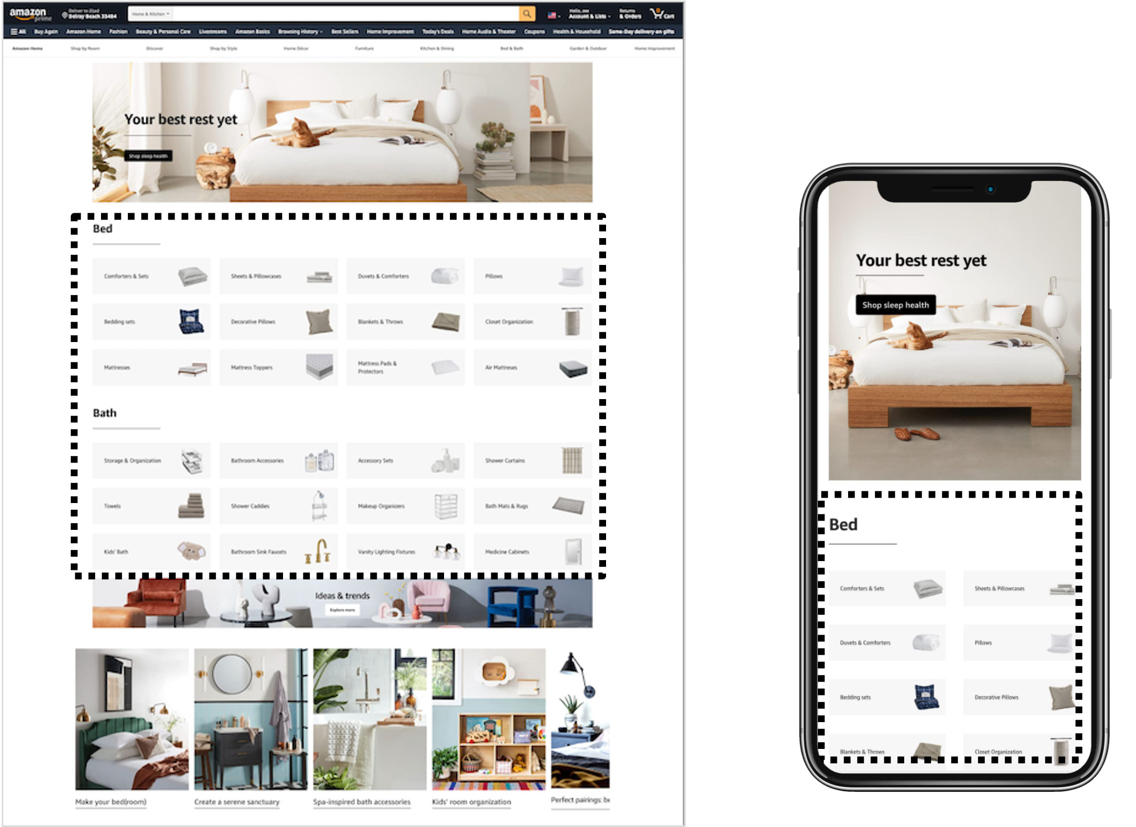
Visual product navigation removes the burden from site navigation. Both desktop and mobile shoppers will benefit…
Featured products blocks display personalized product recommendations that are more likely to appeal to each visitor. Note how this is prioritized above the generic grid of items…
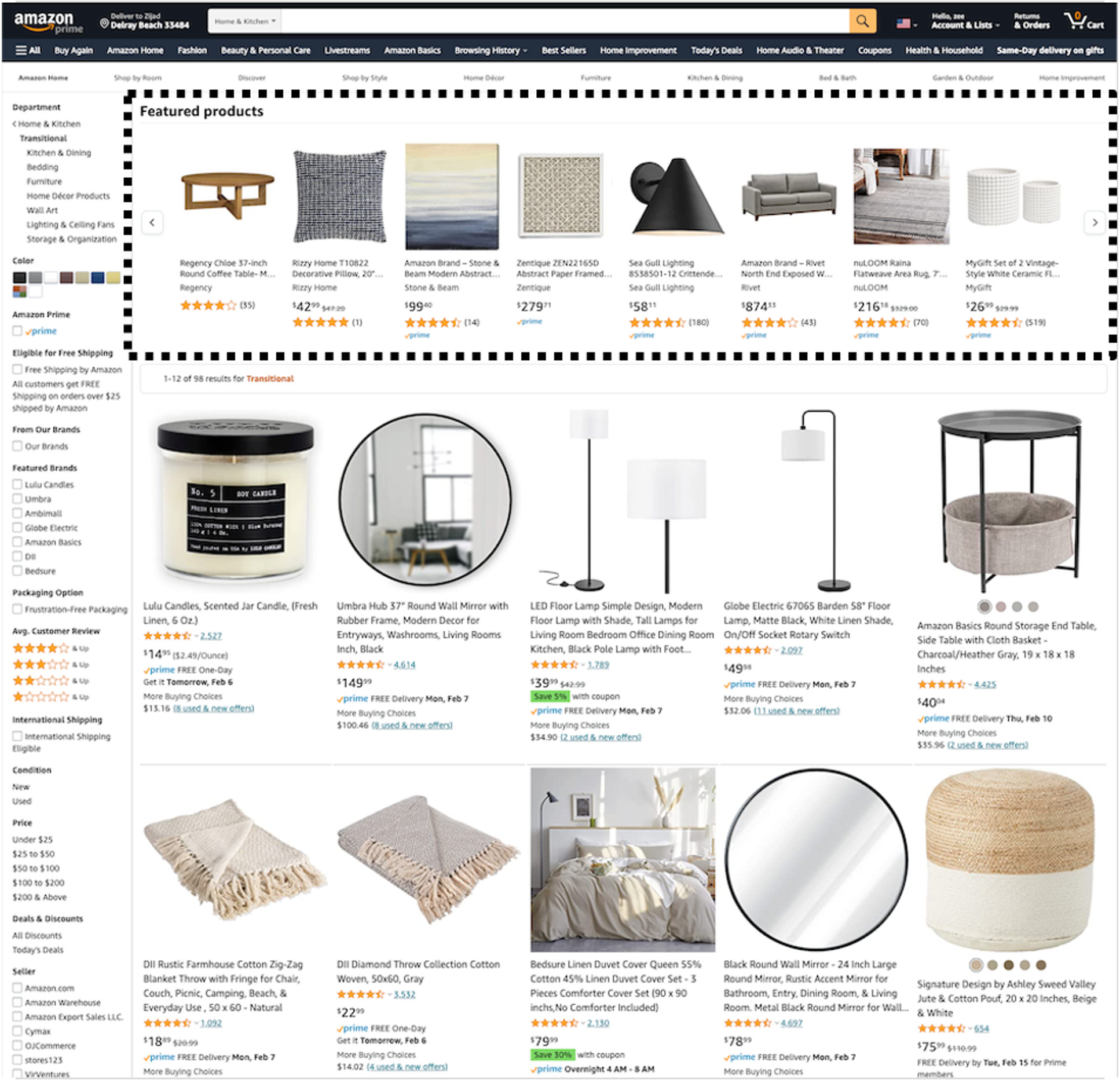
Note: depending on the type of collections there could be more than one of these recommendation blocks stacked above the grid. We have seen cases where there are 5-10 blocks aimed at different ways of helping visitors find what they are looking for.
3 – WHEN they are ready to buy
Amazon discovered visitors’ live actions and context of those actions are much better predictors of product needs and preferences than historical data alone.
This changes the rules of ecommerce in two ways:
- You can now personalize buying experience without knowing a visitor. As a new visitor starts engaging your site, the algorithms detect buying signals. Adapting to preferences on the fly.
- You can now recommend products that are new inventory or long tail products that have few purchase transactions. The algorithms are creating similarities between product attributes while matching it with buyer actions and context.
TO DO: Determine if your site operates the same way irrespective of visitor behavior.
If it does. This is where most sites fail. Even sites that use other personalized product recommendations fail here too.
Do not get confused with promises of app vendors that their recommendations are real-time recommendations. All recommendations are real-time because they generate personalized content in the moment.
The difference is in the quality of the algorithms and how they are trained.
Conventional recommenders use historical data to ‘teach’ algorithms to recognize buying patterns of existing customers. Static rules about how all product recommendations in the future will be made. They always produce the same outcomes no matter what visitors do in the moment.
Case Study: Let’s say I visited a site before and purchased an item for my home office. Next time I visit, the recommendation app on that site will present other products in the same genre. However, this time I have no interest in that stuff since I’m buying a gift for my partner. Something for their love of cooking. The recommendation algorithm is unable to detect a change in my interest. And keeps showing me things for my home office. I get annoyed by the recommendations and quit.
THE ACTION: Show in-session product recommendations.
Amazon’s algorithms are continually learning from visitor actions and context. That’s how they adapt to visitor behavior as they shop. It’s the breakthrough of Amazon’s machine learning capability.
Amazon’s Example:
Visitor engagements with products or collections trigger product recommendations related to visitor behavior. As show below, these recommendations can come in many different settings with many different headlines.
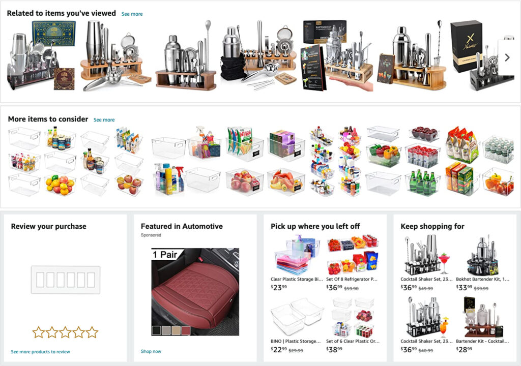
The easiest way to recognize these types of recommendations are headlines like ‘Recommended for you’, ‘Inspired by products you viewed’, or ‘More items to consider’.
4 – WHERE on your site they are engaging
Because of ecommerce’s natural innovation lag, most home furnishings brands think all they need are solid upsell / cross-sell options. Placed on the cart (mini-cart) page and similar product recommendations on the product detail pages.
For cutting-edge revenue machines, like Amazon, the reality is vastly different.
Ecommerce is not a linear sales funnel. Where all visitors start on the same page and follow pre-defined steps. Instead, visitors are arriving at many different pages and dart around the site in almost infinitely different ways.
TODO: Examine how many product recommendation blocks you have on your home and collection pages.
Commonly, Shopify home and collection pages have very few or no product recommendations at all. If this is your situation, you need an urgent intervention!
The following diagram visualizes how Amazon distributes personalized recommendation blocks across their site:
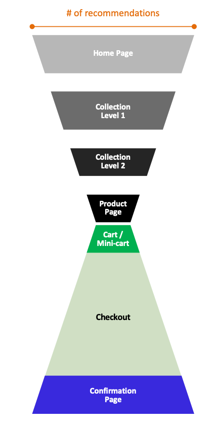
Amazon is the antithesis of the average Home Furnishings store on Shopify. They swarm their home and collection pages with highly-personalized content.
THE ACTION: Flood your site with personalized product recommendations.
There are so many product recommendation strategies that you can apply to your own site.
Amazon’s Example: Product detail pages are often top arrival pages for ecommerce sites. For incoming traffic, the first experience is make or break.
The screenshot below illustrates the lengths Amazon goes to connect with visitors landing on a product detail page:

You’ll notice 8 different product recommendation boxes on this page alone. Eight.
Amazon attacks every visitor-product connectivity chance. Including similar items, related products, products with 4 star and higher reviews, product comparison, related brands, products with price discounts, or best sellers.
More-so, the types of recommendations change and adapt as visitors engage with the site.
4 – WHY would they buy now and from you
There are no magic beans that solves the eternal challenge of WHY. Many small details throughout the buying experience will make a big difference. it could be the visual impression of your brand, product reviews, ability to detect and adapt to visitor affinities, to feature and price comparisons.
TO DO: Check how frequently you resort to price discounting to drive revenue.
Unfortunately, we see price discounting used as the primary sales acceleration option. Rather than the last resort. Price discounting erodes margins. It’s a race to the bottom.
THE ACTION: Blend editorial content, bundle products, connect on emotional levels.
If you think Amazon’s market place is a utility service. And think they do not care about the visual and emotional aspects of the sales process. You won’t believe what I show you next!
Amazon’s Examples:
Differentiation means seamlessly blending editorial content with hyper-personalized recommendations to visually differentiate their offering and create a pleasant buying experience.

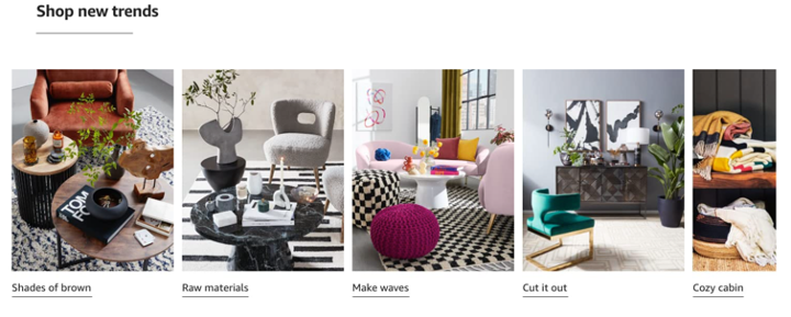
Emotional connection comes from using lifestyle images to inspire buyers’ imagination and drive product interest.
Increased value promoted not by discounting but through product bundling (without price discount) to increase basket value.

To create urgency Amazon will show low inventory levels or delivery dates.
The list of tricks goes on.
Act like Amazon. Develop your own customer bonding formula.
We hope this article will make you realize how much untapped revenue growth opportunity your site has.
We encourage you to try as many ideas in this article as possible. To create and strengthen customer bonds. You should be able to start with the tools and resource you have at your disposal now.
‘5Ws’ concept is super easy to understand and follow. To add new content blocks to your home furnishings Shopify site. With the mission to drive engagements with different types of visitors having different product needs and affinities.
Perhaps, you can also test drive Obviyo for Shopify. It democratizes use of top-tier machine learning for all ecommerce and marketing teams. Powered by the same algorithms used on Amazon’s market place. No-coding required.
7-day ‘Conversion Detox’ offer for home furnishings brands:
There is too much obsession with low conversion rate – with the outcome.
On the other side, there is very little understanding and energy put behind 5Ws that drive conversions. Hence, the need for ‘detox.’
A complimentary, ‘done-for-you’ 7-day use of Obviyo for Shopify.
1. You install Shopify app
Start on Shopify app store then activate from your Shopify admin panel.
2. We initiate your Customer Bond Building routine
Our services team will select and provision 4-6 bond building HyperBlocks™, hyper-personalized content, on your site. Before going live, you’ll review and approve the setup. Once live, your 7-day clock starts ticking.
3. You review results
We’ll meet after at least 7-days of live Customer Bond Building. By then you’ll have enough results and experience to decide if bond building is valuable for your brand.


