Smarter Checkout Choices with Tuccini [Case Study]

Tuccini was born in 2004 out of a simple idea: provide genuine, brand name fragrances to the public at discounted prices. The philosophy driving Tuccini was clear–provide the best service possible by leveraging the latest in innovative technology. As the company grew, the breadth of products offered was extended from exclusively designer fragrances to luxury aromatherapy, candles, and more.
Since such a disproportionately large amount of marketing budget is centered on acquiring new visitors, it’s crucial to capture as many conversions as possible. Tuccini closely monitored their site’s performance and used best practices to facilitate conversions, but needed more advanced technology to fully realize their optimization and conversion goals. They required a solution that would be easy to implement and that could provide consistent revenue lifts for their eCommerce program.
Experiment Setup
Tuccini was interested in testing the following variables on their product detail page:
- Top Area – Explore if navigation, search, and other options are needed in the checkout process.
- Free Shipping – Determine the importance of the free shipping option.
- Recommendation – Determine the impact of upsell recommendations.
- Easy Return – Experiment with return options.
- Coupon – Make coupon option more effective.
- Checkout Area – Experiment with anonymous checkout path.

The first optimization program goal was to uncover winning page elements that would reduce bounces and improve revenue from the checkout funnel.
Customer Insight
Actionable analytics provide an insight into visitor’s reactions to individual options that were used in the optimization process. These results provided pointers about which elements they can use to further improve their revenue performance.

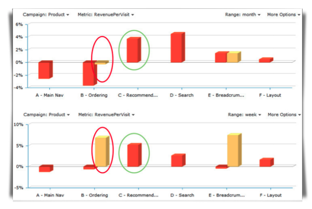
For example, the comparison between the last 7-day (bottom) and 30-day (top) charts illustrates that moving the ‘recommendations box’ (circled green) to another location was consistently good and should be made a part of the page template.
However, the ‘ordering options’ element (circled red) fluctuated more, warranting further analysis and experimentation with copy, images, and offers.
Conclusion
Tuccini realized a significant lift in on-page performance (+19.72% revenue lift) as HiConversion provided the types of actionable insights required to build a roadmap for future iterations of their online retail site.


