When It Comes to Optimizing Payments, Style Matters

It’s no secret that consumers love digital payments. Apple Pay, PayPal, Google Pay, and many other payment apps are taking over the online shopping space as the preferred way to check out quickly and securely.
Merchants who have been optimizing payments are seeing increased conversion rates and revenue, but it’s only the tip of the iceberg. On the other end, those who have yet to provide customers with their preferred payment methods are in danger of losing significant potential revenue by creating this additional friction within the checkout experience (many without even knowing it).
As eCommerce becomes more and more experience-driven, merchants need to know exactly what works best for their customers at any moment while being able to dynamically adapt to ever-changing preferences. Earlier this year our CEO, Zee Aganovic, invited merchants to join a study to learn more about the potential advantage of deploying popular digital payment methods and other methods of optimizing payments.
Our Hypothesis: Not only are digital wallets/payments crucial to the modern eCommerce experience, but so is the design and presentation.
In addition to our hypothesis, we established key goals for our research. These were the things we really wanted to understand based on the data we would collect:
- Challenge working assumptions about efficacy of default payment and wallet styles
- Determine best configuration of wallet payment options in relation to conversion rate and revenue
- Demonstrate competitive advantage of optimizing payments
Our eCommerce optimization software was used gather payment analytics, set-up various experiments to test combinations and build insights on the results.
Why Wallet Styles Matter When Optimizing Payments
According to Zion Marketing Research, digital wallet market share is expected to rise by about 32% from 2017 to 2022.
Obviously, merchants can’t ignore wallet payments–but which ones should they display, and why? With so many digital wallets options available, including them all would add significant clutter to the checkout page. Not having enough, however, would be even more detrimental.
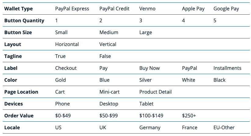
We quickly discovered how complicated the problem of wallet payment configuration gets and the immediate need for a solution. For example, here’s a table of wallet configuration options available to the average merchant:

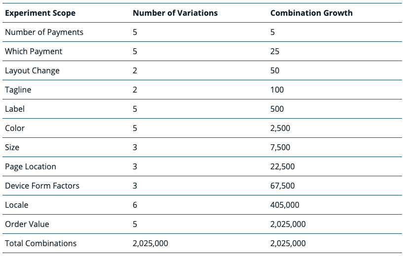
This creates over 2 million possible variations of wallet payments presentation to shoppers on the merchant’s site. Isolating the permutation that resonates best with the customer would likely be painstaking and resource intensive, so a very efficient method of optimizing payments would be required.

How to Find the Ideal Wallet Payment Styles
The name of the game is experimentation. For this study we leveraged the Braintree Payments extension for Magento 2 – this enables quick deployment of popular payments options and streamlined our data collection and staging of experiments. By running multivariate tests (MVT), the participating merchants were able to expose previously unmeasurable analytics for button color and label styles–by device and location–which revealed the significant RPV lift in the winning experiments.
Multivariate testing enables merchants to learn what payment methods their customers prefer, and in turn, which ones to include in the checkout options. During the study, when shoppers saw PayPal, Apple Pay, or another payment method they trust, they were more likely to convert. When they didn’t, cart abandonment rates were higher.
According to the results, multivariate testing looks to be the best choice for merchants to analyze the performance of their digital payment styles. And for those wondering why not just A/B or ‘split’ testing, here’s a quick breakdown…
A/B Testing vs. Multivariate Testing
A/B
|
Multivariate
|

Are Wallet Payment Styles Important for Desktop, Mobile, or Both?
Even as the prioritization of mobile continues, running experiments on desktop remains key for any UX optimization strategy. Our study showed that a merchant has the potential to realize an overall revenue lift of +32.68% through top performing ensembles for desktop, in addition to a +20.97% increase for mobile.
We already mentioned how important testing is for digital wallet payments, but what about the styling of the buttons themselves? Here are a few more valuable insights from our research:
- A common winning treatment has a ‘Buy Now’ label–we speculate that because Amazon uses ‘Buy Now’ for its own One–Click checkout; this has trained online shoppers to think the ‘Buy Now’ label means single click checkout in general.
- The winning button color in top ensembles is black for mobile devices and white for desktop–one can speculate this is because Apple Pay is a fast-growing mobile wallet using a black button.
How Merchants Can Begin Optimizing Payments
We’re excited to share these results with you, because we believe leaving your payment setup unattended is no longer a viable business strategy. With some simple analysis and optimization to your payment UX– all based on what motivates your customers to actually buy– can have a significant and directly-measurable upside for your revenues.
As a wrap up, we’re evangelizing a straightforward strategy to get your digital payments delivering on their promise and growing your sales.
1. Activate popular digital payments methods
Before anything else, a merchant needs a way to receive data about their checkout performance, particularly their digital payment options and design. Also, according to Juniper Research –2.1 billion global consumers are expected to use a digital wallet to make a payment or send money.It’s too big an opportunity to ignore.We believe offering every payment method should be standard in all eCommerce buying experiences to help merchants grow sales.
2. Analyze the performance of your payment setup
After collecting the data, a merchant must analyze where customers are experiencing pain points when checking out. These areas should becomethe focus for the next step, experimentation.
3. Optimize your payment methods to maximize conversions
Once the friction points have been identified, a merchant should run multivariate tests to see which wallet payment design combination yields the highest RPV (revenue per visitor). As shown in the table above, the potential for different permutations running concurrently is endless.


