
Tula Skincare increased mobile product listing page RPV by 26.84%
UNIQUE INSIGHT:
Visiting the product listing page is one of the most critical steps in the buying journey.
Running multiple A/B experiments in parallel enables agile innovations while producing winning ensembles of A/B treatments. Incremental lifts in individual A/B treatments compound to produce an ensemble lift that is much higher than the sum of individual treatment lifts.
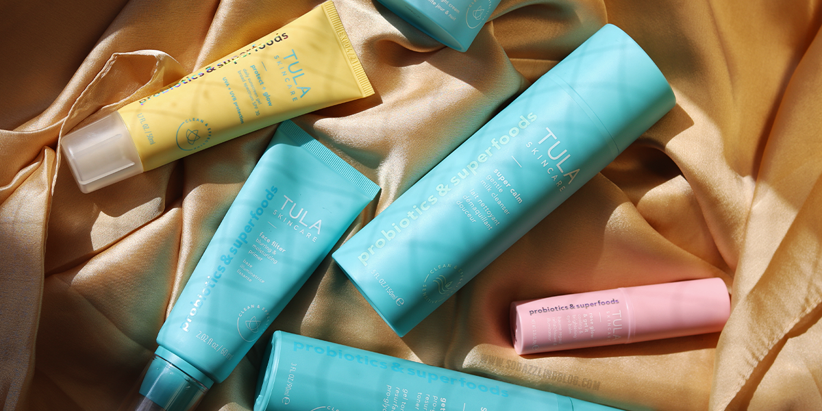
Tula Skincare story.
Tula Skincare was founded by Dr. Roshini Raj, a practicing gastroenterologist, who graduated from Harvard and New York University. Fascinated by the power of probiotics in both beauty & wellness, she’s been studying this field for more than 20 years.
Dr. Raj had a lightbulb moment after seeing the life-changing impact probiotics in the natural diet & in supplements had on her patients’ internal health. Not only were they feeling better, but their skin seemed to be glowing.
In 2014, Dr. Raj launched TULA, applying her medical knowledge to skincare with the goal of restoring her patients’ confidence.
Fast forward to today: at TULA, they don’t think you should have to choose between ingredients that are healthy and what works. Their approach to formulation is simple: they look to research & clinical studies to determine which ingredients they do & don’t include. They also want to help you find your own healthy, balanced life. Their name reflects this, TULA means ‘balance’ in Sanskrit.
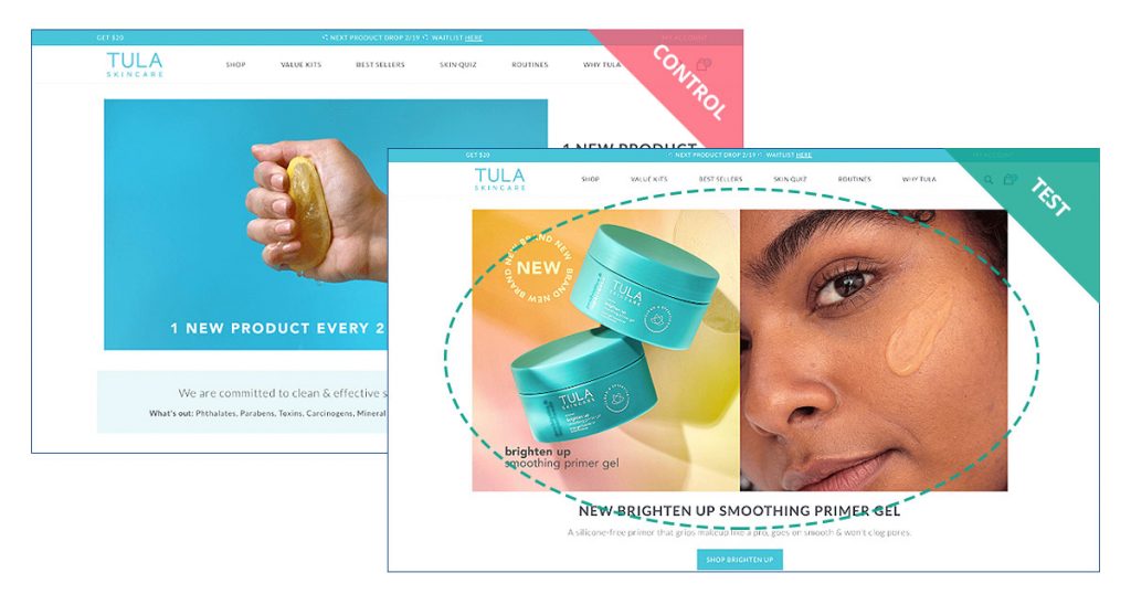
Before
As the beauty market has taken over eCommerce – and it’s quickly become extremely competitive – merchants in this space need every edge they can get in order to attract and retain customers.
This is where CRO (Conversion Rate Optimization) strategy can make the difference.
In simple terms: CRO is the systematic method of turning more website visitors into paying customers, with the goal of influencing each customer to spend more every time they shop.
With their spirit of embracing inner potential, TULA set out to optimize their online store and give their customers the best possible experience when buying their products – by doing so, the up-and-coming brand could potentially cement their place in the highly competitive skincare industry.
After
TULA’s eCommerce team connected with Obviyo through the Shopify Plus network of merchants and tech providers. During an initial call with Obviyo’s customer experience strategists, the Tula team went over general web analytics including funnels, engagement maps, device form factors, and more. Additionally, they discussed the advantages of large-scale ‘collaborative testing’, which enables merchants to compare their (anonymized) experiment results with peers and capture deeper insights.
What follows is the learnings from an ongoing collaboration between the Obviyo and TULA teams.
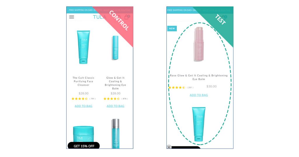
PRODUCT LISTING PAGES
Funnel and visitor session sequence analysis revealed the Product Listing Page (PLP) as a weak link in the shopping journey.
Use of engagement maps enabled TULA to focus their attention on a few page elements:
- Product Recommendation Grid
- SEO Container
- Afterpay payment method
- White Spacing
- Call to Action (CTA)
Unlike conventional A/B testing where A/B tests are run sequentially, i.e., one after the other, Obviyo’s multivariate experimentation and optimization platform enables running multiple A/B experiments at the same time.
PRODUCT RECOMMENDATION GRID
Hypothesis
Displaying the Best Seller recommendation grid in a single column should make individual products more visible.
Redesign
The Shop All PLP on the site has a single column arrangement, so we tested this design on the Best Seller page.
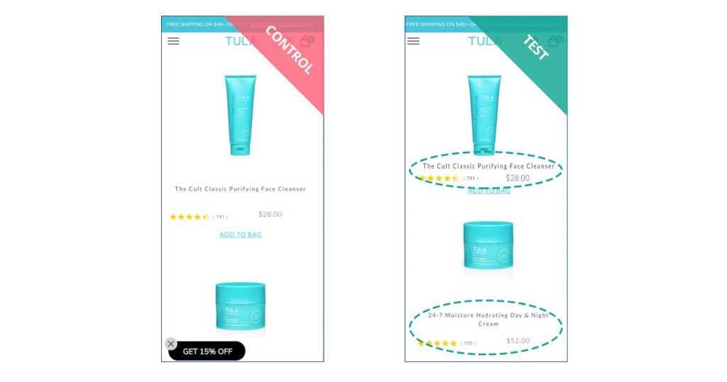
WHITE SPACING
Hypothesis
Reducing the white spacing should help cut down the overall length of the PLP and provide visitors with a cleaner, more seamless experience.
Redesign
We reduced the white space between:
- Image, title
- Title, reviews, price
- Reviews, price, CTA
We also aligned the reviews and price elements, in addition to reducing white space between different products.
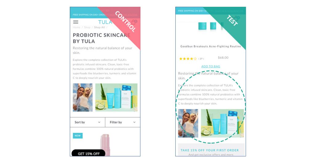
SEO CONTAINER
Hypothesis
Relocating the text and image to the bottom of the PLP will give the page a cleaner look and push the product listing up, making the products much more noticeable to visitors.
Redesign
We relocated the SEO element to the bottom of the page and suppressed any unwanted white space from the top of the page.
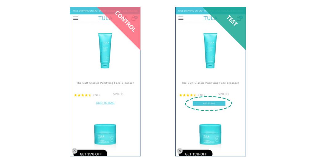
CTA
Hypothesis
Making the CTA prominent compared to other elements on the PLP will encourage shoppers to interact with it.
Redesign
We changed the CTA to a solid box with the color #48C6D9 and “ADD TO BAG” in white.
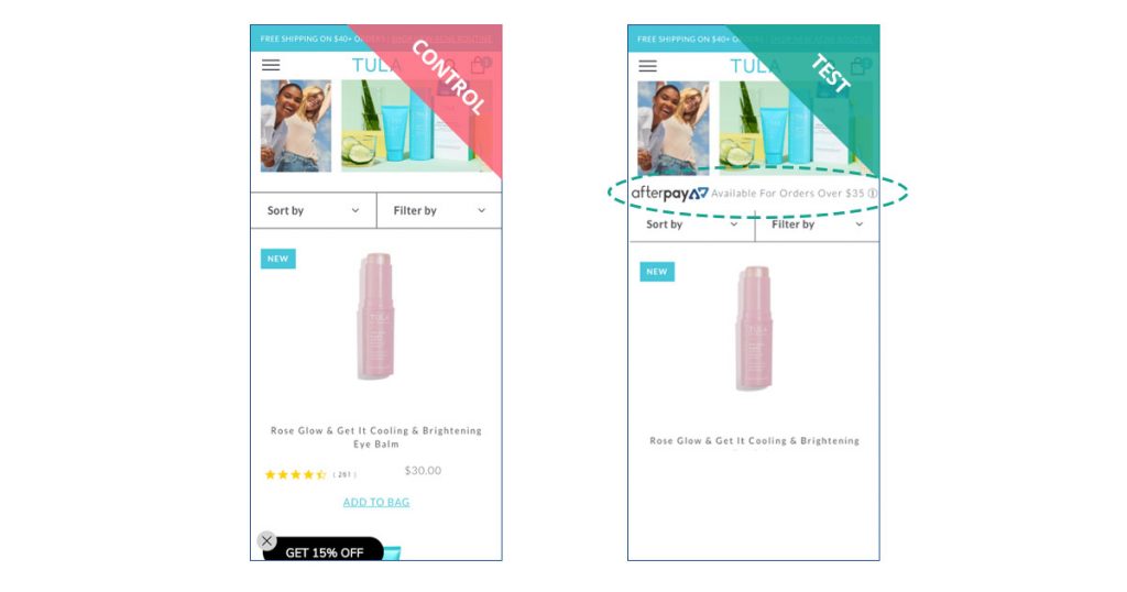
AFTERPAY
Hypothesis
Making visitors aware of additional payment options should help capitalize on a wider range of shoppers.
Redesign
We added the Afterpay banner above the product grid.
Results
| Visits | Conversions | CR Lift | RPV Lift |
| 1,160 | 118 | 23.34% | 26.84% |
UNIQUE INSIGHT
Visiting the product listing page is one of the most critical steps in the buying journey.
Running multiple A/B experiments in parallel enables agile innovations while producing winning ensembles of A/B treatments. Incremental lifts in individual A/B treatments compound to produce an ensemble lift that is much higher than the sum of individual treatment lifts.
MERCHANT VALUE
With Obviyo’s Optimize, this brand is able to rapidly experiment and optimize shopping experience.
As a result, they’re significantly increasing visitor revenue-per-visit (RPV), while learning about their customers’ unique preferences.

“Obviyo Optimize has exceeded my expectations. After years of using other optimization platforms, like Adobe Test & Target or Optimizely I thought I have seen it all. Ability to run multiple A/B test in parallel while having algorithms learn and adapt in real time is impressive. Embedded rich data analytics was unexpected and is very valuable.”
– Zachary (Zack) Abbell, Vice President, Digital & Ecommerce at TULA Skincare
Bonus Material
Experience optimization is a continuous improvement process. The following are examples of other optimization campaigns done by Tula’s ecommerce team.
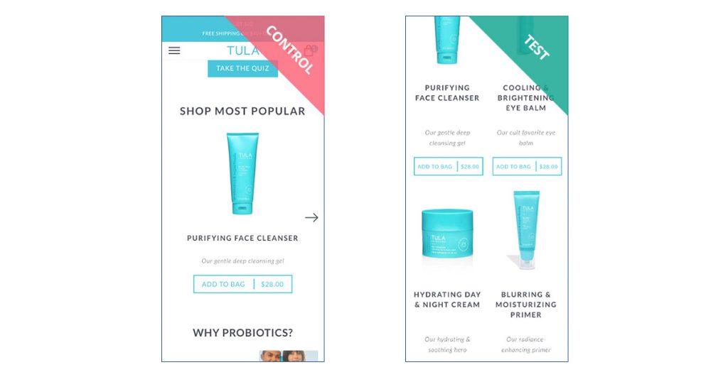
MODIFYING POPULAR PRODUCTS PAGE INCREASED ENGAGEMENT BY 4.39% ON MOBILE
Hypothesis
The grid will allow visitors easier access to all popular products at once instead of using the navigation arrow to view each product individually.
Redesign
List the products in a 2×2 grid instead of a slider.
Results
| Visits | Conversions | Click Rate (Engagement) |
| 53,945 | 5,949 | 4.39% |
SWAPPING PAGE SECTIONS INCREASED ENGAGEMENT BY 1.25% (MOBILE) AND 38.14% (DESKTOP)
Hypothesis
Identifying the sections of the page that are comparatively more engaged by the user and relocating them to the top of the page should increase user interaction.
Redesign
Swap Popular Items section with Take a Quiz section.
Results
| Visits | Conversions | Click Rate (Engagement) | |
| Mobile | 154,874 | 17,129 | 1.25% |
| Desktop | 19,200 | 352 | 38.14% |
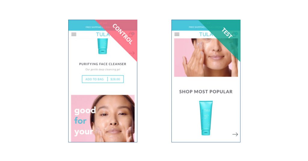
BIGGER HERO IMAGE ON HOME PAGE INCREASED ENGAGEMENT BY 22.54% (DESKTOP)
Hypothesis
Increasing the size of the hero image should draw visitor attention to the highlighted offerings in the carousel.
Redesign
Make the hero image full-width on the home page.
Results
| Visitors | Conversions | Click Rate (Engagement) |
| 22,426 | 506 | 22.54% |
OPTIMIZING CHECKOUT EXPERIENCE INCREASED CONVERSION RATE BY 3.43% (MOBILE) AND 11.30% (DESKTOP)
Hypothesis
Cutting down on visible page elements in addition to shortening the copy should reduce time spent on checkout and improve likelihood of completion.
Redesign
Suppress Amazon Pay on Checkout Page and change shipping verbiage from “Free USPS Standard Shipping (3-6 Business Days)” to “Free Standard (3-6 Business Days)”.
Results
| Visits | Conversions | CR Lift | |
| Mobile | 2,138 | 1,850 | 3.43% |
| Desktop | 3,091 | 2,303 | 11.30% |
CONTEXT MATTERS: MOBILE VS. DESKTOP
One of the more interesting findings TULA made was the difference in results between some of the mobile and desktop versions of the same test. Namely, the hero image experiment.
It could be possible that the old creative looked better on the limited mobile screen due to the color contrast in the image and elements around it. We speculate that this could be why it received higher engagement compared to the new creative.
 However, due to the short testing period and limited conversions, the results may be inflated. Compared to the baseline on desktop, we can see that the new creative received positive engagement from users.
It could be possible that the introduction of a new image piqued the interest of site visitors, or the image itself might be more aesthetically aligned to the rest of the desktop home page.
 Although the testing period was rather short, the significant number of conversions is a good indicator that users prefer the new image on desktop.
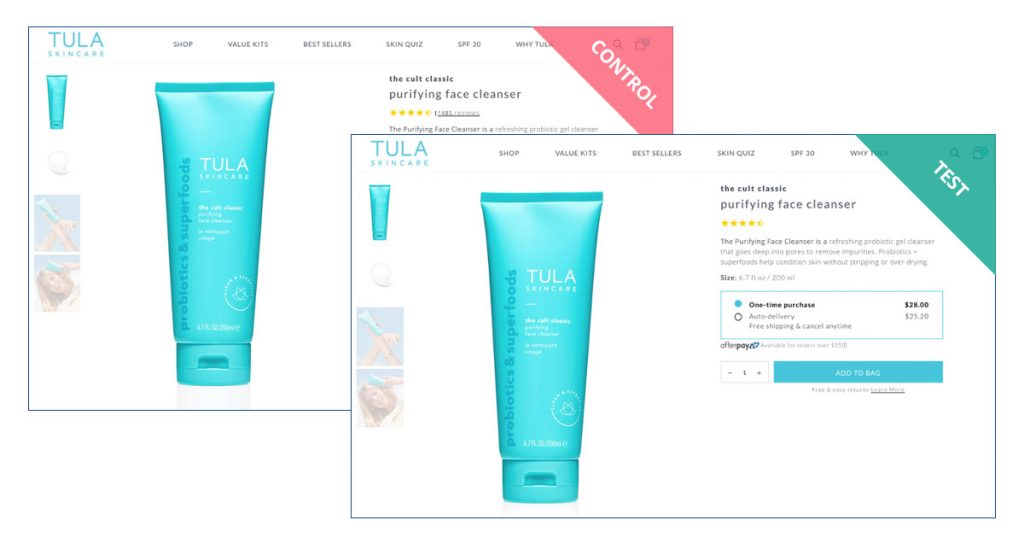
DO CTAs AND REVIEWS MAKE OR BREAK ONLINE SHOPPING UX?
After seeing how big of an impact the CTA and Review treatments had on the PLP campaign, the TULA team became curious about what would happen if they took the same approach with the Product Detail Page (PDP).
Similarly, to the PLP, this round of testing will focus on:
- Suppressing description and verbiage
- Enlarging CTA
- Relocating elements
- Suppressing reviews and stars
- Reducing clutter on PDP
We’re excited to share the results of these upcoming experiments in the coming months. Here’s a sneak-peek at one of the proposed desktop tests:
 It will be interesting to compare the performance of this campaign, which focuses specifically on these two elements, with the multivariate PLP experiment where they were just part of a larger ensemble.
ADAPTING TO PANDEMIC WITH MESSAGING TREATMENTS
TULA was one of the thousands of merchants that found themselves needing to react quickly to the sudden challenges brought on by COVID-19.
The surge of eCommerce buying combined with shipping carrier staff shortages created delays that would surely affect customer satisfaction. Knowing this, TULA ran a simple test informing the customer of this during checkout:
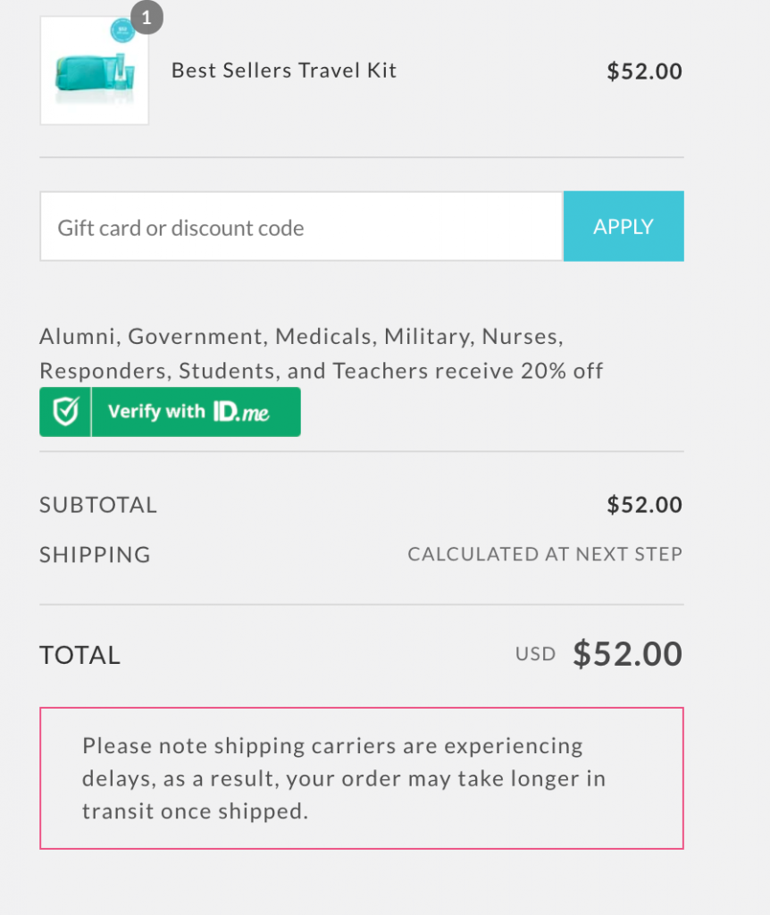
The result was a 12.76% CR lift on Desktop and 14% on mobile – clearly, small courtesies can make a big difference when it comes to checkout.
What Can the eCommerce World Learn From TULA?
Being a challenger brand in the ultra-competitive health and beauty industry – dominated by household names – presents merchants with a mandate to innovate faster than their counterparts.
However, very few brands are optimizing buying experiences. Part of the reason why is because many teams see it as risky.
- “What if the experiments decrease revenue?”
- “Who will have the time to oversee these projects?”
- “Why should we do all this just for a few conversion rate boosts?”
Our collaboration with TULA proves that risks are marginal if any and the benefits very substantial.
As the team uncovered more and more insights during optimization, they were inspired to get creative and introduce their own hypotheses based on what they were learning. What started as a simple analysis and testing initiative guided by Obviyo turned into a powerful way for TULA to self-manage their customer experience optimization initiative. They haven’t stopped experimenting since.