Your Shopify Sales Experience Might Be Too Pushy (And Why I Believe Empathy Influences Conversions)

Shopify stores are becoming an increasingly popular way for brands to sell online. In this article I examine how bad sales habits from brick and mortar retail are negatively impacting Shopify sales, and share my recommendations for increasing your conversions by adopting a ‘customer service’ mindset.
Do you remember walking into those fancy department stores using the signs on the ceiling with arrows for each department as a guide?
The white tiled floor designating paths leading head-on to the perfume counter.
They would try to spritz you with whatever bottle they were pushing that month. Hoping of course that you’d love the smell and have to buy it right then and there.
I remember cutting through the clothing racks, weaving to and fro, in an attempt to evade them. Can’t a girl get to the shoe department without ducking around?
It didn’t seem to matter which way I entered the building. It was inevitable that I would need to politely decline the spritz. Not that I could dodge the smell that somehow filled the entire floor.
Why did this leave such a negative impact on me? Perhaps it has something to do with working retail through my college years.
Or now that I work with Shopify stores, I see some of the same sales tactics applied online and we can do better.
Is your online store acting like a pushy salesperson?
A salesperson’s job is to get me to buy something. Plain and simple.
Many Shopify store owners treat their homepage and product pages as their salesperson.
A popup, for example, is like a salesperson asking to spritz. Something so in my face that it forces me to turn, I mean, click away.
Ben Jabbawy, founder of Privy – a leading Shopify marketing platform – shares his experience with one of these:
Spin to win – another tool in the conversion toolset.
Love it or hate it?
I’m discussing on today’s ecommerce marketing school pic.twitter.com/5udYAW1Yk8
— Ben Jabbawy (@jabbawy) August 3, 2020
What if, instead, we approached sales from a customer service perspective?
The role of customer service is to answer questions and solve problems.
When your Shopify store acts as customer service instead of sales, you’re no longer focused on this particular sale. Instead, you’re focused on this one, and the next one, the one after that, and so on.
Give customers the information they need before buying
Online shopping is nothing like going to the department store. Shopping online doesn’t provide the opportunity for us to pick up products, try something on, or feel the texture. The product page must do this work for us instead.
Product pages are often the most content neglected.
Besides price and a buy now button, guide a customer’s decision with as much detail as possible. In addition to your descriptive verbs, include care instructions, use cases, and adjectives such as narrow, soft or boxy. These will answer potential questions they may have.

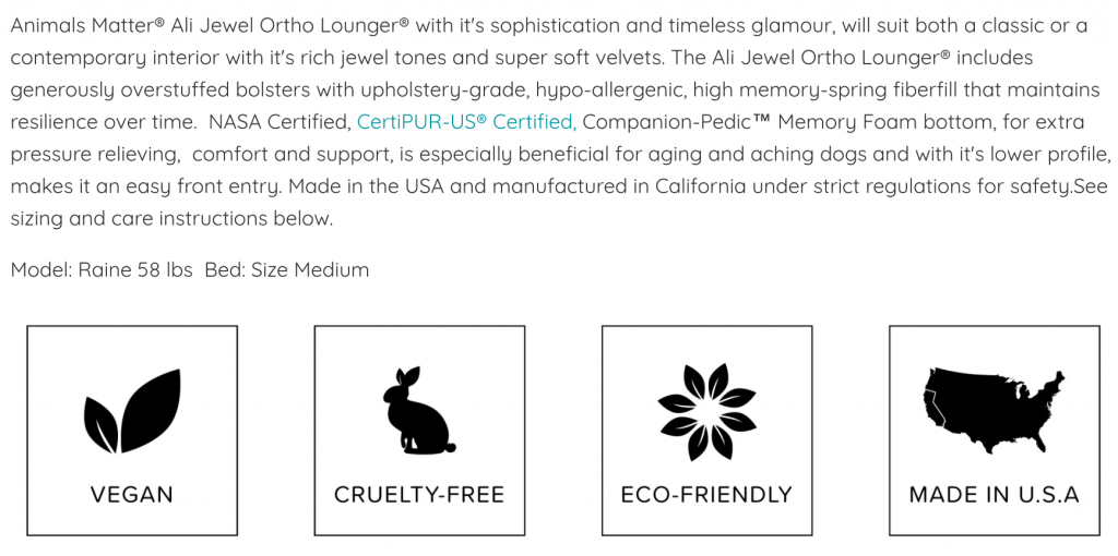
In the above screengrab from Animals Matter, the merchant uses an in-depth description that thoroughly covers the quality, feel, and durability of the product.
Adding certifications from NASA and CertiPUR-US builds trust in the customer by letting them know that the bed was made with care under strict specifications. Also, the 4 icons communicate that the dog bed is made with sustainability in mind which makes the customer feel good about their purchase.
Pro tip: Don’t leave any questions unanswered about your product in the description.
Your online store has multiple ‘front doors’
Also, unlike a department store, there isn’t a clear entrance to the store. We can enter the store from any page including the homepage, a product page, a collection, or blog posts.
The fastest way to lose a customer is to make them guess what you sell. Instead of asking for help, they’ll dodge you altogether.
Basic pages such as about us, shipping and return policies, and contact us should be easy to find. It’s also beneficial to have shipping and return policies directly on your product pages.
Here’s a great returns policy for FiftyThree’s Pencil:

For extra credit, provide a phone number in the header/footer.
Use the WHOLE web page
Remember that people will scroll and read below the fold. *shocked*
People scroll because they are looking for answers to their questions. Most people skim to see if there is anything of interest. If the information is organized and easy to find, they continue to read.
People won’t read something they aren’t interested in. If it’s not compelling, difficult to see, or it’s complete nonsense, they won’t read.
When they reach the bottom of your page it likely means you didn’t provide enough information.
It’s like someone wandering to the back of the department store trying to find the perfect gift and coming up empty-handed. The inevitable results: they buy nothing.
The path to conversions starts on every page
Messaging happens at every page of your Shopify store.
Help customers to make educated decisions. Use clear messaging of who you are, why you are so awesome, what products you have to offer, and how your product solves their problem.
Take a look at your Shopify site. Is it clear who you are and why customers should buy from you? In a Website Review, it’s one of the first things I check. Without this, you’re leaving money on the table.
—
This article was provided by Ilana Davis. Ilana is a Shopify Superhero who works with e-commerce shops to remove friction from the buying process. She rescues websites creating effective websites that attract more visitors, provides better SEO, and increases conversion rates at a fraction of the cost of a full redesign. Connect with her at ilanadavis.com.


