Mobile Checkouts: 5 Things We’ve Seen Have the Biggest Impact

Mobile customer experiences continue to lag behind desktop [1], costing merchants millions of dollars per year in potential revenue. But how can merchants recapture this massive loss? Which elements of the mobile experience have the biggest impact on conversions?
We’ve spent the last few years teaming up with hundreds of merchants to understand more about how the mobile customer experience (CX) impacts their sites, and what can be done to increase mobile conversions [2].
The core of this initiative has been testing the same UX change on multiple sites. These parallel experiments allow merchant participants to share anonymized data and compare their results.
By doing so, merchants gain insight into the mobile practices that are most likely to work for them based on the results of similar participants.
Websites, of course, are highly contextual. No test on another site ensures success for your own. However, this data can—at the very least—help streamline hypothesis formation.
1 | Hiding chat in cart increased mobile revenue by up to 7%.
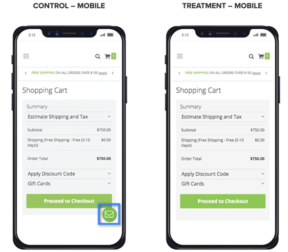
Why test it? Distracting elements may pull visitors away from their intention to check out. Eliminating the chat function from the cart [3] and checkout pages could help keep the focus on completing the checkout process [4].
How it works. This experiment automatically detects chat elements on cart and checkout pages and hides them to reduce distractions for shoppers.
Sample results from real sites.
| Revenue per Visitor (RPV) | Conversion Rate (CR) | Visits | |
| Site 1 | +2% | +18% | 11,387 |
| Site 2 | +7% | +26% | 2,812 |
What it means. As with other experiments that aim to reduce distractions on cart and checkout pages, this experiment performs particularly well on mobile.
We’ve seen this experiment work more than once and affirm that a simplified checkout funnel can have an impact on RPV (especially on mobile). Across all sites that ran this test, mobile treatments saw a conversion rate lift of +11.47%.
Things to consider. Chat is still an important function [5] and should appear prominently in other areas of an ecommerce site. However, results from this experiment show that it could be a distracting feature on the cart and checkout pages.
Who should try it? This experiment is recommended for all merchants currently using chat on their websites, especially during the checkout phase.
However, no two merchants are the same. Dig into your chat data first—you may have high-user engagement with the chat functionality. If the data indicates that chat increases your conversion rate and/or AOV, approach this experiment with caution.
2 | Automatic cart update increased mobile revenue by up to 12%.
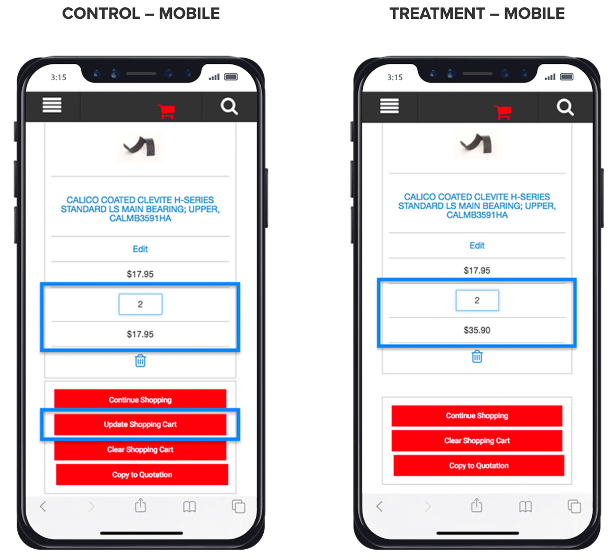
Why test it? A growing number of mainstream sites are implementing automatic cart updates. Removing the “update cart” button simplifies the process for shoppers as they make changes to their purchase and eliminates unnecessary distractions for those who aren’t.
Online buyers demand a frictionless shopping experience, and any improvements toward those elevated experiences can also increase conversion rates and sales. This experiment removes a manual step that a shopper has to take by automatically updating cart item quantities.
How it works. Hide the traditional “Update Cart” button and implement a treatment code that automatically refreshes item totals when a shopper changes the quantities of items in their cart.
Sample results from real sites.
| Revenue per Visitor (RPV) | Conversion Rate (CR) | Visits | |
| Site 1 | +11% | +8% | 6,504 |
| Site 2 | +12% | +9% | 391,519 |
| Site 3 | +5% | +2% | 541,084 |
What it means. Collectively, across all sites, implementing the auto cart update produced a considerable lift on both desktop and mobile sites, +4.60% and +6.60%, respectively.
Further analysis revealed a gap in RPV between new and returning shoppers. Some returning shoppers may have expected to update their cart manually—as they had in the past—and become confused when the cart updated automatically. This type of friction should lessen over time.
Things to consider. Merchants with a large percentage of returning visitors should pay special attention to the results for those visitors.
Who should try it? The auto cart update experiment is a great fit for merchants who currently have only a manual update functionality. Merchants who sell multiple units of the same products more frequently have a greater potential to benefit from this experiment but will want to monitor returning visitors closely as well.
3 | ZIP code auto-fill increased mobile revenue by up to 4%.
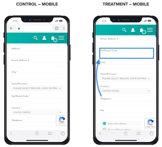
Why test it? Conventional wisdom says that reducing the number of keystrokes should drive more revenue. The zip code auto-fill experiment reduces the amount of typing required during the payment process, which should make it easier and faster for the user to complete the form.
This test could be especially valuable for merchants who have noticed high cart abandonment or if their form analytics show that users drop off before completing their address info.
How it works. We applied a widget using the HiConversion app (our product) that auto-completes the city, state, and country fields with the zip code. Shopify apps like Bolt default to this functionality.
Sample results from real sites.
While most merchants experienced mobile RPV and CR gains during testing, some didn’t fare as well—which is exactly why testing is crucial.
| Revenue per Visitor (RPV) | Conversion Rate (CR) | Visits | |
| Site 1 | +4% | -6% | 199,853 |
| Site 2 | +2% | -2% | 81,183 |
| Site 3 | +3% | +3% | 6,907 |
What it means. For most sites, zip code autofill seems to have a positive impact—reducing typing should increase the chances of completing an online store sale. It may not work for all, but it’s surely worth a test.
Who should try it? The zip code auto-fill experiment is available to merchants with sites where the city/state is requested before the zip code, or where the zip code doesn’t populate following input of the city/state.
4 | Displaying cart total in header boosted mobile rev by up to 29%.
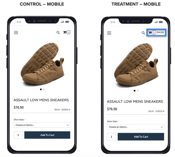
Why test it? Shoppers can sometimes forget about items added to the cart. Once an item is added to the cart, this experiment makes the cart total continuously visible throughout the buyer journey.
Displaying the cart item total (i.e. the total number of items added to the cart) in the header or navigation is a common practice. However, many shoppers are accustomed to this and no longer notice its presence—nor is the number of items necessarily the most valuable information to share.
Displaying the cart dollar total could reduce cart abandonment rates by reducing surprises—like the “sticker shock” when shoppers transition to the checkout page.
How it works. Once a shopper adds a product to their cart, the total dollar value of the items in the cart is displayed next to or below the cart icon on the header or navigation.
Sample results from real sites
Merchants in this testing group experienced mobile increases in RPV and CR, with some decreases in AOV:
| Revenue per Visitor (RPV) | Average Order Value (AOV) | Conversion Rate (CR) | Visits | |
| Site 1 | +3% | -3% | +5% | 21,695 |
| Site 2 | +29% | -15% | +42% | 10,532 |
| Site 3 | +12% | 0% | +13% | 172,983 |
What it means. Mobile and desktop visitors saw positive lifts in Revenue Per Visitor (RPV). In this experiment, the RPV lift was achieved largely from lifts to the conversion rate, despite a slightly negative impact on AOV.
This suggests that visitors are more likely to complete their sale when the total cart value is displayed transparently in the header or navigation, but they may not spend as much money on each visit.
Things to consider. While the focus of this post is mobile checkout optimization, know that desktop visitors responded particularly well to this treatment.
This could be because, as in many cases, desktop elements don’t have to compete as much for space or attention as those on a smaller mobile screen.
Who should try it? Merchants should first consider whether they prioritize AOV over RPV. While your RPV is likely to increase with this test, note that your AOV may not experience the same gains—and may even decline.
Weigh the pros and cons of this with your team.
5 | Hiding product-level breadcrumbs grew mobile rev by up to 8%.
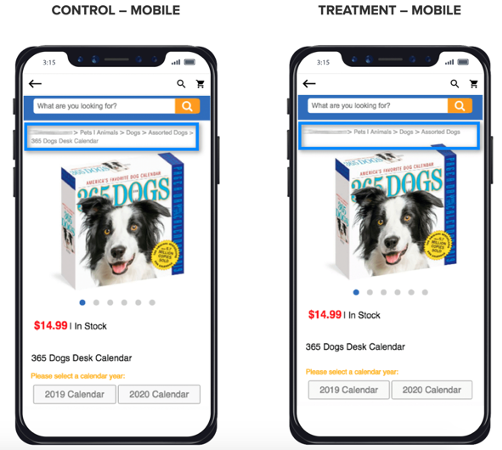
Why test it? Most merchants implement breadcrumbs. They’re a standard convention to help shoppers sort product views by category, determine the category of the product, and find their way back if they make a wrong turn.
But even trusted conventions should be tested and optimized. For example, a product name breadcrumb that, if clicked, would only reload the product page is redundant. This mobile design experiment tests whether suppressing the product name in the breadcrumb trail reduces visual distractions.
How it works. Suppress the last level of the breadcrumb trail—the product name.
Sample results from real sites.
| Revenue per Visitor (RPV) | Average Order Value (AOV) | Conversion Rate (CR) | Visits | |
| Site 1 | +8% | +4% | +3% | 6,588 |
| Site 2 | -2% | -8% | +7% | 3,485 |
| Site 3 | +2% | -13% | +15% | 2,630 |
What it means. While this experiment shows only a modest positive RPV lift, the average overall results remain strong. Across all tests, suppressing the product name in breadcrumbs resulted in an average RPV and CR lift on mobile devices of 3.16% and 10.00%, respectively.
Things to consider. If the product name is not visible above the fold on a product page, the product name breadcrumb may be the only indicator of the product the user is viewing. Take note of this before removing the product name from the breadcrumb trail.
Who should try it? This experiment is recommended for any merchants who currently use extensive breadcrumb trails on their ecommerce sites (typically companies with large product catalogs).
Recap
Your mobile checkout experience is make-or-break when it comes to securing conversions.
Every merchant’s site is different, and no two customer experiences are the same. You must run your own tests.
Here’s a recap of our findings:
- Hide chat in cart and checkout. Eliminate distractions on cart and checkout pages. Chat is still an important feature on many sites, although merchants should use caution in steps critical to conversions.
- Auto update carts. Remove manual steps and decrease friction in the checkout process. Be cautious of its impact on returning visitors who are accustomed to a different flow.
- Autofill ZIP code Reduce errors and time required to complete checkout. Testing recommended for forms that do not auto-populate fields based on location.
- Display cart totals in the header. Reduce “sticker-shock” when transitioning to the checkout Visitors may be more likely to complete their sale—but with a lower average order value.
- Suppress product-level breadcrumbs. Reduce visual distractions, especially on sites that may have multi-line breadcrumbs because of a large product catalog or long naming conventions within product categories.
Resources
- https://www.cmswire.com/customer-experience/why-mobile-customer-experience-is-still-lagging/
- https://cxl.com/blog/make-mobile-convert/
- https://cxl.com/ecommerce-best-practices/shopping-cart/
- https://cxl.com/blog/how-to-design-an-ecommerce-checkout-flow-that-converts/
- https://cxl.com/blog/how-to-make-live-chat-convert/


