5 Checkout UX Designs Your Customers Will Love This Holiday Season

Brands need more effective checkouts so they can serve customers better and retain more of their business – especially during the holidays.
With eCommerce rapidly expanding this year and merchants having to react quickly to the tsunami of new digital shoppers, it’s now critical to have a site that doesn’t underperform on conversions.
So, what can merchants do to adapt to the changing times?
We put together this article to share insights learned over several years of helping merchants optimize their websites during the most critical times of the year. There’s a lot that goes into effective checkouts (design, payments, copy, and much more) but it also shouldn’t be daunting.
Most, if not all, of the following experiments resulted from analyses that exposed costly friction points common to many eCommerce sites.
1 | More Payment Options = More Conversions
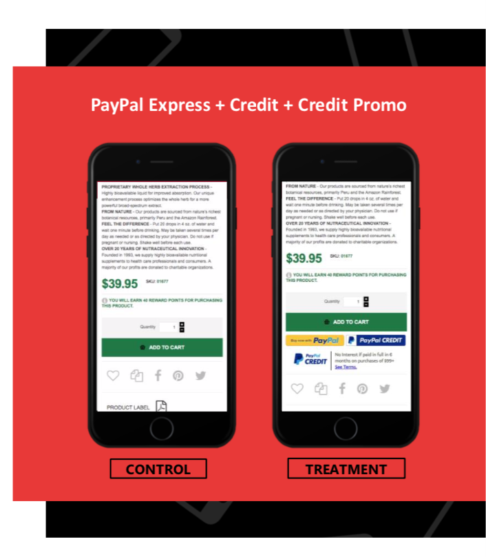
According to a 2018 study by comScore, PayPal performed, on average, 60% higher than other digital wallets and 82% higher than all payment types combined. Overall, PayPal held an 88.7% conversion rate on merchant sites.
It is widely known that consumers lean heavily on credit solutions during holiday shopping seasons, and PayPal Credit is a 21st century solution for users to apply for credit and defer interest and payments for a time.
Testing has suggested that enabling PayPal Credit available as an Express Checkout Method, in combination with lightweight promotional messaging, drives strong RPV lifts for many merchants year-round.
This combination, aided by holiday preferences shifting towards credit-based payment options, should make for a very smart experience to deploy during the holiday season.
As more and more payment options become commonplace in our shopping experiences, finding the best configuration of solutions, exposure and promotional callouts will become a bigger focus for testing and optimization.
2 | Coupon Collapse Increased Mobile RPV by 14.87%
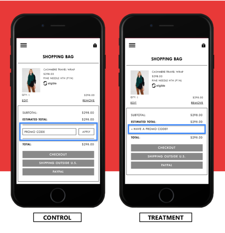
Exposed ‘Promo Code’ forms can present an unnecessary distraction to users, who may be tempted to leave the site in search of a code that will save money, at a very critical point in their path-to-purchase.
To remove unnecessary distractors from the checkout flow, we collapsed the existing open fields for promo code and gift card inputs into expandable elements.
Without removing the option to use a promo code, we are focusing attention on the checkout button.
As you can see, this treatment created a significant boost in RPV on both mobile and desktop during the holiday testing period.
3 | Simplified Header Boosted Desktop Revenue by 6.10%
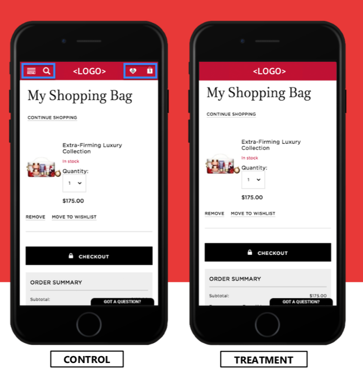
When adding items to a cart, shoppers want a fast and easy way to checkout or continue shopping.
Removing items not directly related to these two actions should increase the likelihood of a completed sale while not hurting Average Order Values.
Again, this experience resonates more strongly during the Holidays than other parts of the year. Mobile performance increased significantly while desktop also improved, just as we saw with Coupon Collapse.
This is another experience that all merchants should strongly consider playing specifically during the holidays, if not year-round.
4 | Using Free Shipping to Decrease Cart Abandonment
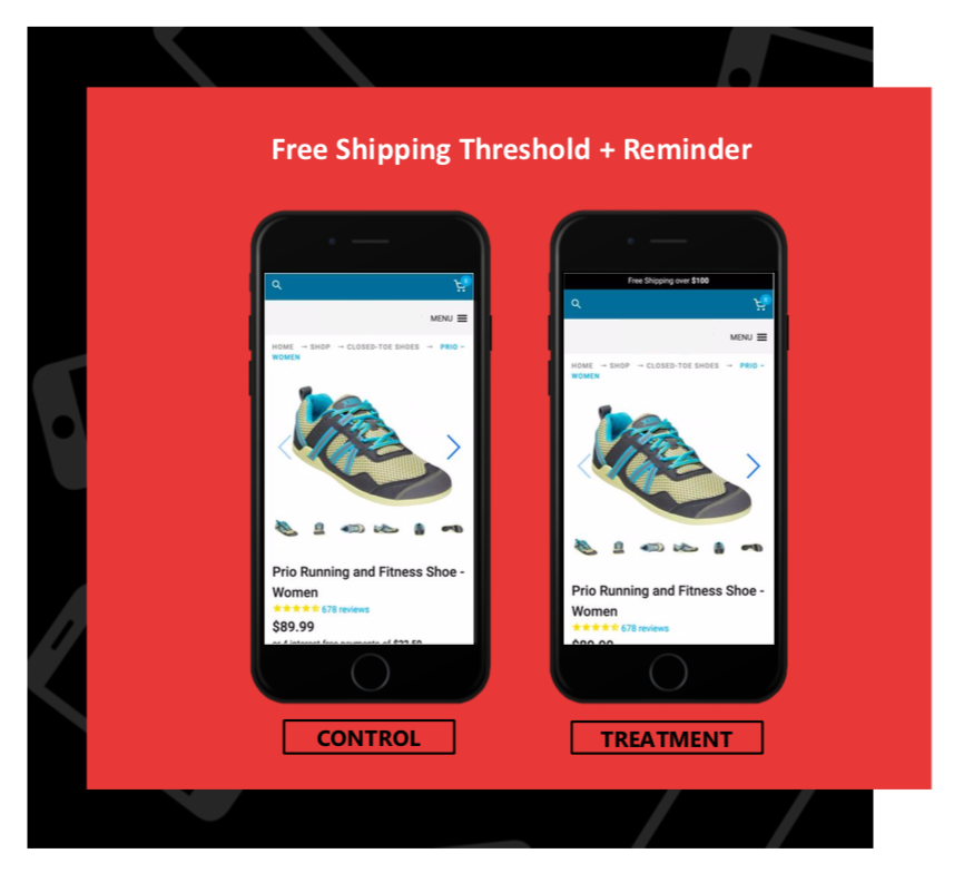
Shipping can often complicate a purchase for holiday shoppers, sometimes to the point where the purchase will be abandoned all together.
This holiday season we will examine the concept of offering Free Shipping at a defined threshold, in addition to the visual promotion of the threshold in various ways across the site.
Offering Free Shipping at a defined threshold may encourage users to buy more and checkout sooner.
Additionally, merchants that offer Free Shipping at a defined threshold may benefit from emphasizing the offer across the site or in key conversion areas.
5 | Holiday Styling for a Happier Shopping Experience
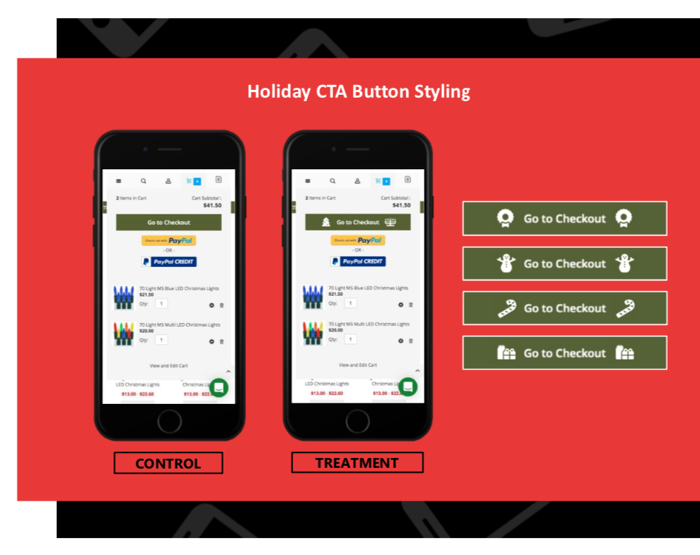
Shopping experiences should be seasonal, from promotions all the way down to Add to Cart and Checkout button design. Every detail counts.
These festive treatments could apply on Add to Cart as well as Checkout buttons–with many different options, you can have some fun with the combinations.
Keeping Up with Evolving eCommerce
Before this holiday season gets underway, take some time to think about what obstacles have been keeping your business from generating more revenue.
- How have you optimized in the past?
- What were the results?
- Did you learn from your business only or from other sources too?
Challenging the status quo and what are seen as best practices in eCommerce allows us to explore greater possibilities in optimization and revenue growth.
eCommerce is evolving faster than ever, and merchants deserve a better way to optimize. The holidays are the opportunity to maximize growth but have been historically underutilized due to stagnant testing methods and limited data. Instead of continuing to operate from our “eCommerce silos”, it’s time to for all merchants to unite.
Being data-driven isn’t enough anymore– merchants need to be able to utilize not only their own data but learn from their peers as well to capture the insights needed for continuous growth.
We hope that this article has enlightened you about the huge potential of holiday optimization and given you a good starting point should you choose to run tests of your own in the coming months.


