4 Steps to a Better Customer Experience in 2021 [WIth Examples]

Have you ever looked at your website with the intention to optimize but felt overwhelmed at all of the testing possibilities?
We’ve all been there. Between all of the different page classes, the hundreds of existing elements, and the ideas generated from everyone at the table, designing testing concepts that will successfully improve customer experience is like trying to hit a bullseye blindfolded. Here’s the secret…
Testing doesn’t have to be random.
There’s no reason to take a stab in the dark when there’s a more assured method for identifying high-probability testing locations, elements, and ideas.
Only data can equip you to reliably optimize your site and maximize revenue.
Let’s face it–the current standard of generating test ideas is either costly, ineffective, or both. Expensive marketing analyses are nothing more than qualitative assessments made by people with less brand knowledge than you, and while focus groups might have some user insight, they comprise such a small sample that they can’t be representative of the rest of your customer demographic.
At the end of the day, these qualitative analyses don’t hold a candle to what quantitative data can do for your site.
Deep Analysis vs. Best Practices
Data-driven testing is so much more powerful than using “best practices.” Qualitative analysis is a good start, but there is no need to settle when you have the ability to use quantitative site analysis to uncover actual customer behavior patterns and derive hypotheses based on what the data is displaying.
Unfortunately, most conventional A/B testing tools don’t have the deep analytics necessary to uncover these data truths. Testing services will suggest “best practices” that are arbitrary; the ideas worked in one situation so the eCommerce world latched on, which is of course no indicator that they are right for your site or your customers. On the same side of a different coin, common analytics tools can provide plenty of insight, but then there is no ability to test any hypotheses identified.
Why choose between deeply integrated analytics and high-level multivariate testing capabilities? Get yourself a tool that can do both.
When analytics and testing are integrated in one tool, it unfolds an endless cycle of customer understanding.
It really is the best of both worlds. Initial data analyses can provide new ideas to test that might not have even been on the radar if the focus was only on best practices. Once the test has been run, the test results provide more data from which more test ideas can be procured. Those ideas provide more data when tested, and when combined with other data it can lead to super data and then to super testing!
So where do we jump in to this infinite loop? Let’s talk about 4 simple steps to help you optimize and generate additional revenue for your site.
Step 1 – Know Where to Improve Your Customer Experience
The first step to improve the customer experience for most eCommerce sites is to take a look at device performance to focus on a particular platform. For this particular company, mobile traffic is dominating in number of visitors, but the conversion rate is vastly underperforming. Mobile optimization should be a focus.
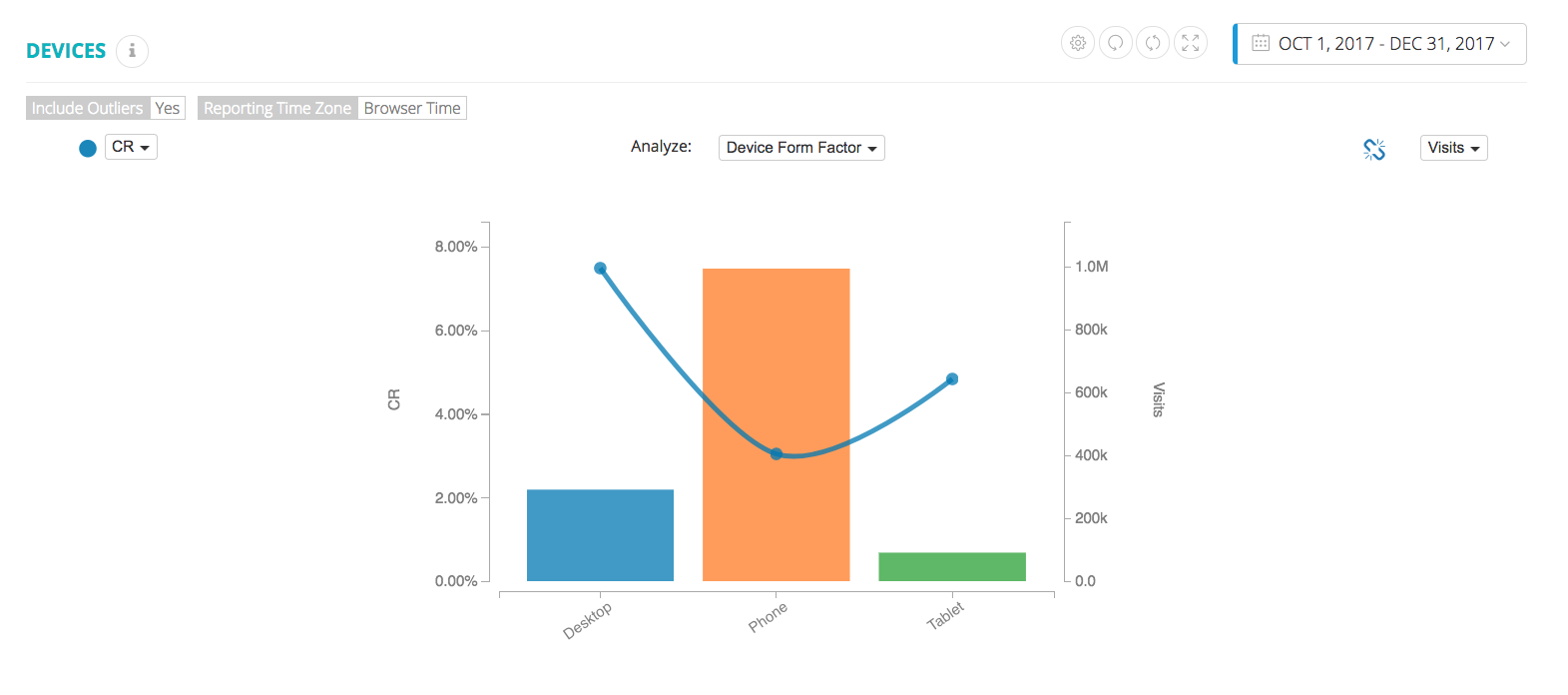
The bars represent the number of visits to each platform, while the blue dot is the associated conversion rate.
From there, let’s take a look at the sales funnel which uncovers weak points in the customers’ paths to purchase. Because we know that mobile is an optimization priority, we segment the chart so that we’re filtering to see mobile traffic only, and thus weak mobile customer experiences. We’ll filter all future charts to see only mobile traffic.
In the mobile sales funnel below, we see three kinks, indicating three general realms for improvement. First, moving from all visitors to browsers, indicating that the bounce rate is too high. Second, moving from window shopper to shopper indicates that the cart rate is too low given that a user has viewed a product detail page. Finally, a kink in between shopper and buyer indicates a low conversion rate, given the user has a cart.
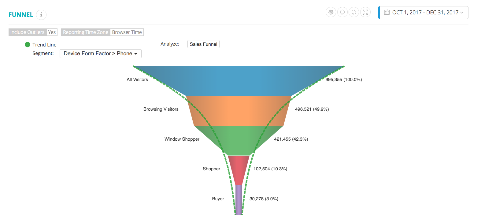
Each step of the funnel adapts to the site’s actual performance.
Any three of the kinks would be a great place to start, but in this particular scenario we will focus on the top of the funnel–bounce rate.
To identify the problematic page classes for bounce rate, let’s take a look at where visitors are arriving.
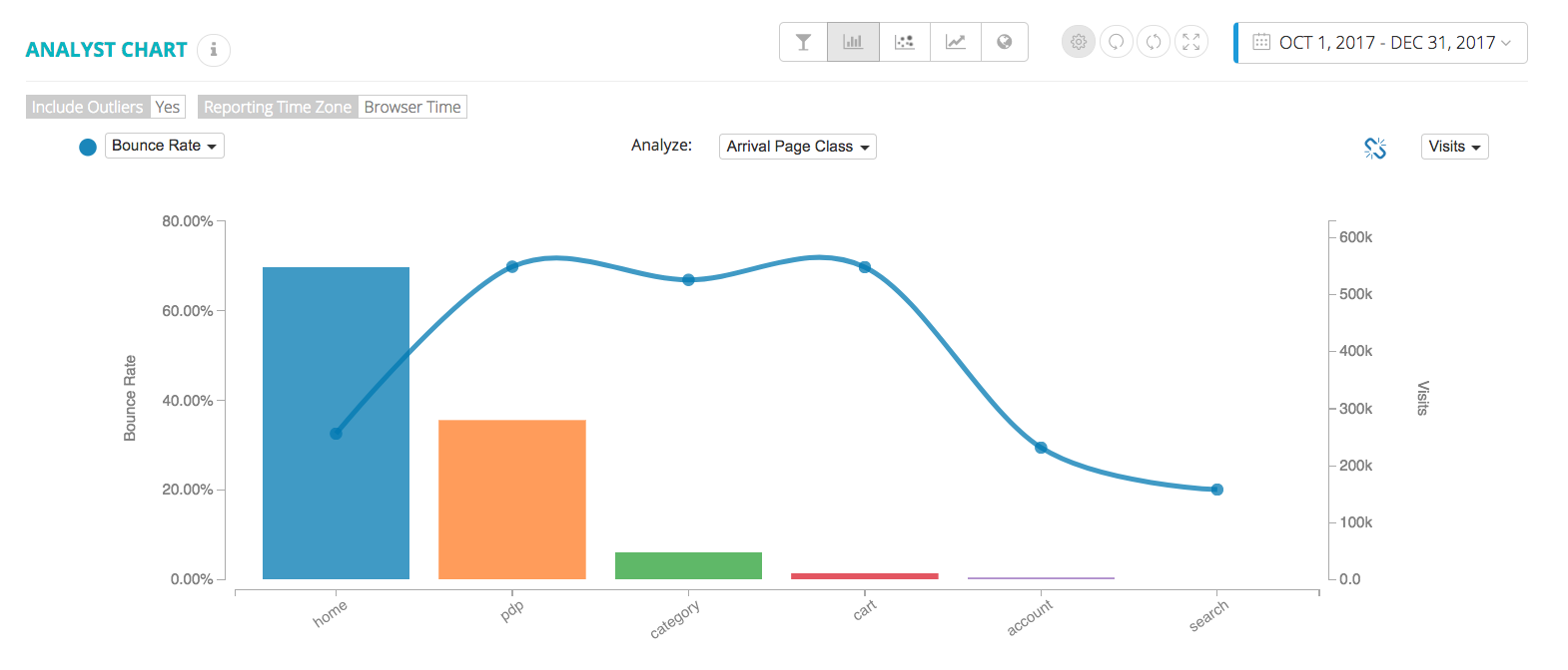
The bars represent number of mobile arrivals to each landing page, while the blue dot shows associated bounce rate.
From this chart we have identified two potential page classes to test: the product detail page (PDP) and the home page as they comprise over 80% of all bounces. However, we can recall there was an additional kink in the sales funnel moving from window shopper to shopper, so by prioritizing the PDP as an optimization focus, it’s double the trouble.
Step 2 – Generate Test Ideas
Now that we’ve identified an optimization focus, we can drill down to the specifics of the mobile PDP. Below is a Sankey chart, which displays page paths for a particular page class. In addition to showing how many visitors are coming and going to the PDP from other page classes, this chart shows the relative performance of each step (the chart is currently showing conversion rate, but could be changed to any other metric of interest).
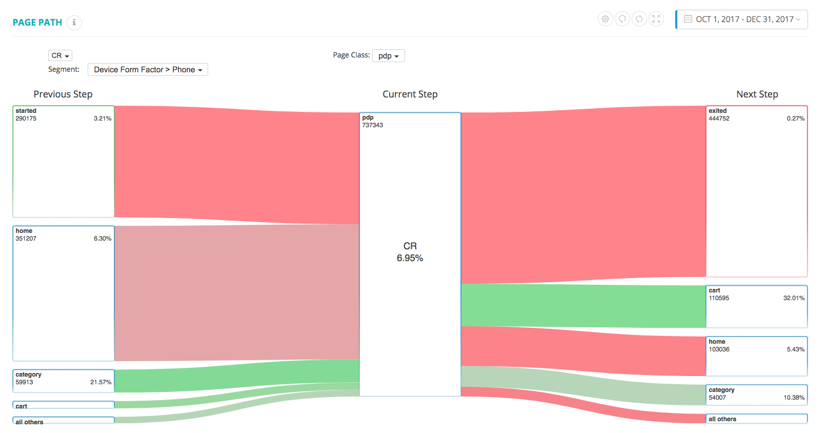
The width of each band is proportional to the number of mobile visitors moving to and from the product detail page (PDP), and the color of each band indicates if that step is above or below average conversion rate.
As expected, since we were drawn to the PDP primarily due to a high bounce rate, we see that the largest next step is exiting. To help this bounce rate, one testing goal would be a way to encourage customers to continue browsing on the site. Still learning from the Sankey chart we see that, after going to the cart page, the next most used step is going back to the home page, but it’s negative. This seems to be the primary way that users continue browsing, but it is ineffective when compared to the next most used step, which is viewing a category page. A testing goal can be to increase the ease with which users can reach another category page from the PDP.
Now, to really get into the details of how to improve the customer experience, we can take a look at a video of the engagement map of the page in question. This is no ordinary click map–while we are able to see engagement on every click element where the size of each bubble is proportional to the number of clicks, the number within each bubble is the actual conversion rate associated with each click. Additionally, the color of each bubble indicates if it is above or below average conversion rate for all of the click elements on the page, which allows us to quickly see what elements work well, and which could use improvement.
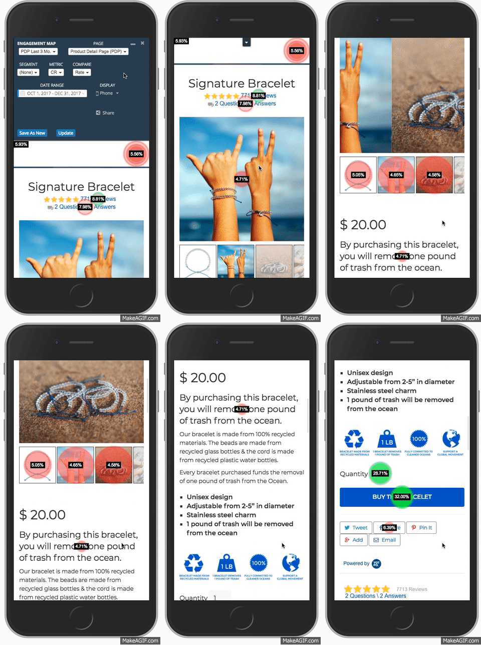
Qualitative assessment can work well, but there is nothing like having data to back up theories. For example, we could have qualitatively assessed that an automatic slider on a product page is unconventional, and probably unnecessary if thumbnails are shown below. However, when this is coupled with the fact that the engagement on the thumbnails is negative, it absolutely makes this a viable area to test.
Step 3 – Run Your Experiments
We did end up testing this concept – one of the treatments in the multivariate test was disabling the automatic slider. If visitors want to view more images, they still have the freedom to tap on thumbnails, but the images no longer slid on their own.
In order to improve the customer experience successfully, not only should you view general engagement maps, but you should also also get as specific as viewing engagement maps for a treatment, as the data compares the performance of the page relative to the control.
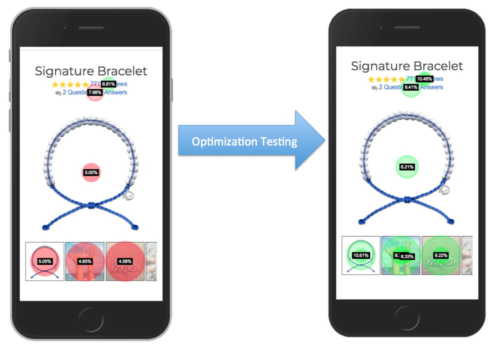
We see that the relative size of the interaction on the thumbnails did not change very much, but the actual performance of each interaction improved significantly! It seems that users who have actual intention to peruse through images prefer to do it on their own schedule, rather than seeing images change without any intention.
This treatment also had one of the strongest impacts on bounce rate. The name of the variable was abbreviated to S1, and you can see in the chart below that the bottom 4 leading bounce rate lifts all contained the S1, or slider, treatment.

These bars show the bounce rate performance for each combination of treatments tested compared to the orange line, which is no treatments playing at all. Any shown combination with “S1” means that the aforementioned slider variable was playing in that ensemble.
Step 4 – Don’t Stop Optimizing
This was only one example of one treatment of one multivariate test of one page of one client. You can see how the data analysis tools equip you to test with abandon because all of your ideas are data-driven. When the test is over, not only can you measure overall performance, but you can also get as specific as seeing the improvement of each element on the page.
After finding a winner, there’s a new and improved baseline from which to discover new kinks in the user experience. Sites and user patterns change, which creates an endless optimization loop.
Data-driven testing isn’t a foolproof process; nothing is. However, the ability to use analytics to improve the customer experience on a deeper level leads to some truly educated hypotheses that usually turn out to be winners. Even when a test is negative, data collected allows us to determine what users did not like, and the test can be reverse engineered and reinitiated accordingly.
If your testing tool has integrated deep analytics, there is no end to the insight that can be gleaned to provide ideas for continuous data-driven testing.
It’s time to take the blindfold off and approach testing with eyes wide open. Let rich integrated analytics be your torch for navigating through the dark and winding roads of e-commerce testing and personalization.
Want to learn more about how you can improve your customer experience? We recommend starting with the checkout.


